A student at the Eugeniusz Geppert Academy of Fine Arts in Wroclaw, {tag:studenci}, a student at the Faculty of Interior Design, Design and Scenography, designed a space designed for women.
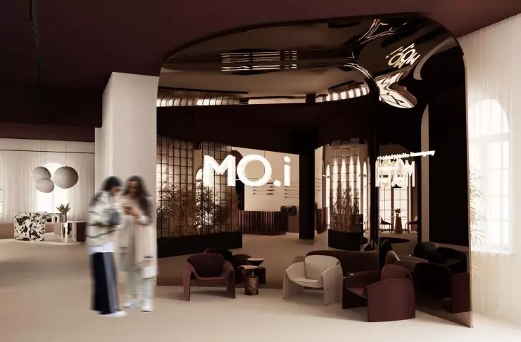
MO.i is a place where you can rest, relax, meet with friends or get beauty treatments. All this in interiors framed by expressive forms and colors.
Natalia Kedzierska's concept is a semester-long project completed during classes at the Interior Design Studio, taught by Katarzyna Anna Jagiello, PhD, Aleksandra Przybyla and Tomasz Taciak. As the location for the project, the student chose theexisting H-14 building located on the Stanislaw Wyspianski Coast in Wroclaw.
The cafe zone is located on the first floor
© Natalia Kędzierska
In the project, the designer focused on two floors of the H-14 building. On the first floor, she placed zones generally accessible to everyone - a café, showroom and toilets. Above, on the second floor, there was a service area - a reception desk, a hair and beauty salon. All levels also have designated spaces for utility rooms, back rooms and an escape cage.
The first floor is the public area there is a cafe and showroom
© Natalia Kedzierska
originality of forms and strong colors
The student's main design consideration was minimalism and originality of forms. She presented the entire space in a contrasting color scheme, combining various shades of maroon and red with beige. On the floor she proposed micro-cement, which often goes to the walls as well. The author wanted to move away from the classic white ceiling, so she designed it in a dark maroon color. The choice of materials is also an important element. Patterned stone adds character, while black accessories and a light fixture emphasize the geometric forms used. The introduction of pampas grasses combined with velour fabrics adds to the coziness of the entire space.
in the showroom, the most important are the displays
© Natalia Kedzierska
cafe and showroom
To the left of the entrance to the building, the author placed the main staircase and elevator leading to the other floors. Their form refers to the whole concept. On the right side of the entrance is a wall made of bent sheet metal, which shows information about what can be found on each floor. There is also a seating area here.
The main colors of the project are shades of maroon, red and beige
© Natalia Kedzierska
Immediately after the entrance, the cafe area appears with a characteristic element - a minimalist bar counter. In the middle of the cafe are located the author's seats and tables. The oval pattern on the floor is duplicated in the form of a colorful mirror suspended above the seat.
A characteristic accent is the patterned stone
© Natalia Kedzierska
The showroom area features three main displays that showcase new product collections. The lighting above them is a reference to the form of the lower elements of the displays. In the rest of the showroom, the author designed numerous shelves and storage space.
The author also used pampas grasses as decorative elements.
© Natalia Kedzierska
cosmetic and hairdressing zone
Entering the first floor of the building, we find ourselves in the reception area, where we can hang up our outer clothing and move on to the next zone. The cosmetic zone, thanks to the introduction of round shapes of tables and lighting, refers to the forms designed in the showroom. On the wall, behind the pedicure space, the author placed numerous plants. In the hairdressing space, on the other hand, she proposed an original form of mirrors - set in a built-in and illuminated from behind. The floor of this area is decorated with a rounded shape made of white and black stone.
The original illuminated mirrors are embedded in the built-ins
© Natalia Kedzierska
See also the design of the showrooms: cosmetics brand Moré by Alicja Pieczykolan and and MISBHV designed by Michal Werner. The works were also created during classes at the Interior Design Studio.


