Located in Ålesund, Norway, the MODO Store designed by Polish architects Maksymilian and Hanna Sawicki of Maksymilian Sawicki Arkitektur is nominated for the Archdaily Building of the Year 2022 award, in the Commercial Architecture category. There were only two projects from Norway in this category - the store in question and the reMarkable Pop Up Store by Snøhetta.
MODO Store is a 220-square-meter facility showcasing flagship Scandinavian fashion brands, expressing a unique identity. The design by INAINN ARCHITECTS is a modern approach and interpretation of Nordic simplicity.
The interior and its elements form the backdrop for the exhibition
© INAINN ARCHITECTS
textures, shine, light
The architects, through the use of common materials, mainly sourced from local production, created a store interior that serves as a backdrop for the fashion and items on display. By using mirrored and semi-reflective materials, the space multiplies and optically enlarges. Positioning the objects in a linear arrangement, along the two main walls with the entire space propped, provides enough space for customers visiting the store.
The objects are set in a linear arrangement
© INAINN ARCHITECTS
The materials used in the project were selected for texture, gloss and color, and matched the existing interior elements. The effect is smooth transitions, overlapping textures and a play between what is new and what is old (coming from before the renovation). These simple treatments are meant to emphasize the contrast between untreated building materials and unfussy fashion items.
Numerous mirrors and lights optically enlarge the space
© INAINN ARCHITECTS
steel and concrete
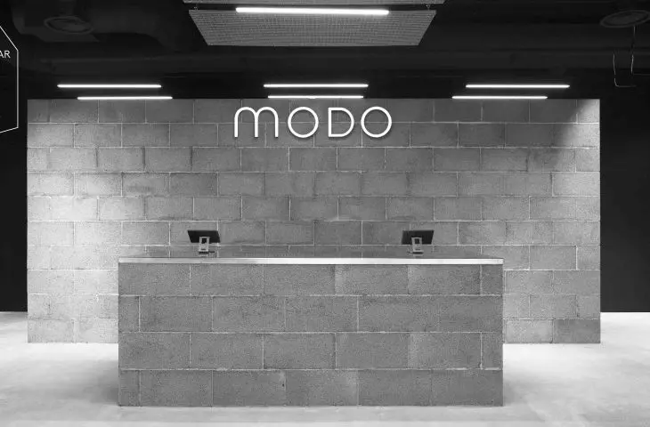
The interior of the store is dominated by custom-made stainless steel modules arranged in a central area, which can be positioned as desired. Seventy of them have been placed throughout the store. In the farther part there is a cash register and a wall built of concrete blocks, which with their roughness and weight, contrast with the shiny steel elements.
MODULE DESIGN
© INAINN ARCHITECTS
Steel curtains used at the front of the store, become its facade half-obscuring the merchandise, but also create an unusual storefront display. The products on display, shine through a grid of industrial steel trusses.
Steel curtains are a distinctive design element
© INAINN ARCHITECTS
engaging space and sustainable design
The goal of the project was to create a flexible interior, open to a diverse range of functions - special events or displays of new collections. The idea came from the growing trend of online shopping and contributed to the overarching goal of creating an engaging store environment with a diverse and responsive design for customers, the architects explain.
The cash register and wall were built with concrete blocks
© INAINN ARCHITECTS
Importantly, the project used materials from local manufacturing markets and certified Greenguard fabrics from kvadrat, which were hung in the fitting rooms.
Our project represents sustainable design and is a thoughtful interior concept that, like most Scandinavian fashion brands, follows the latest trends in sustainable design," conclude Maksymilian and Hanna Sawicki.
