Work submitted for the competition
"Best Interior Design Diploma 2020/2022".
The modernization of the airport terminal was aimed at providing greater comfort to users and guaranteeing facilities for the elderly, people with disabilities and those traveling with children. Thus, new rooms were created, such as play areas and childcare rooms
children, and an escalator and additional elevator were installed.
Access to the medical aid station has been improved and the process of evacuating injured people has been streamlined. The use of acoustic finishing materials has helped eliminate unfavorable reverberation.
information desk and check-in area
© Malgorzata Gastol
To streamline the check-in process, a modern stand for self check-in was planned. Waiting in the departures area has become more pleasant thanks to the possibility of watching a movie. All the equipment and facilities used use the latest technology.
While waiting for your flight, you can watch a movie
© Malgorzata Gastol
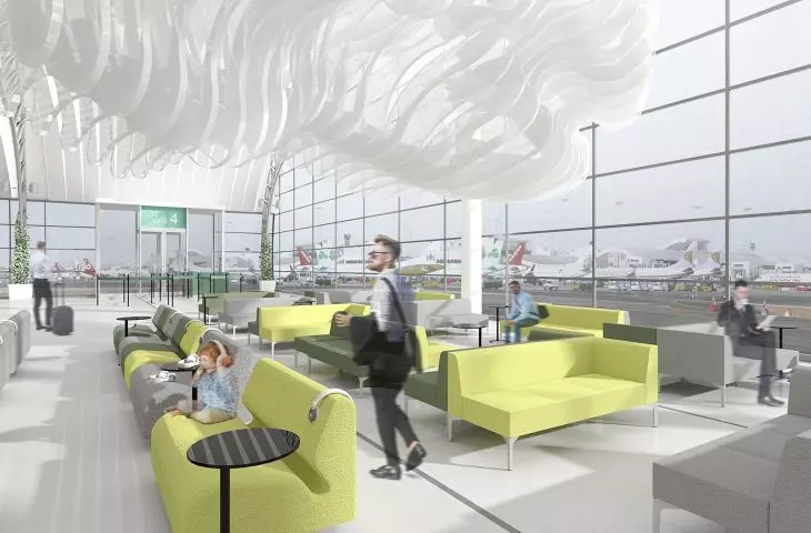
The whole concept is maintained in colors referring to the initial state of the terminal: subdued shades of gray, white and elements in the shade of oak dominate. The aggressive orange color has been replaced with muted shades of green and a vivid lime green accent.
Passenger Terminal modernization project, projections and sections
© Małgorzata Gastoł
Green is the color most often found in nature, so it is always perceived positively. Its use in the check-in area has a relaxing effect on passengers, soothing the stress of traveling and waiting in line. Wooden elements add coziness to the interior, and thanks to their properties they reduce reverberation time. The glazed facade provides an inflow of natural light. On cloudy days and after dusk, spotlights, subtle illumination of the ribs of the suspended ceiling and LED strips are used.
The main means of expression used in the concept are arc and line
© Malgorzata Gastol
The main means of expression used in the concept are the arch and the line. The façade has been combined with the roof of the building - creating a unified, compact mass and imposing an arch shape on the ceiling. Oblique shapes were also given to the partition walls. Their form was emphasized by the use of different finishes: a smooth surface covered with white paint, thin slats and oak-colored veneer. The shapes of the walls determine the direction of the floor layout, whose material and color variations delineate the individual zones of the terminal.
Important compositional elements that bind the whole concept together are thin streaks of light
© Małgorzata Gastoł
Important compositional elements that bind the whole concept together are thin streaks of light. The motif of luminous lines intersecting planes appears in every zone of the terminal and refers to the runways on the tarmac and the lines left in the
sky by airplanes. Although all the designed areas of the terminal maintain material and color consistency, thanks to additional compositional elements they retain their distinctiveness and gain a different user perception.
zone with information points
© Małgorzata Gastoł
The entrance hall, which includes a check-in area and a waiting room, is primarily intended to allow passengers and visitors to easily orient themselves and ensure comfortable waiting. For this reason, the area has been stripped of distracting decorations. In highly visible areas
directional signs and an airport plan have been hung, while orange-colored information points have been located in the central area of the zone.
the main motif in the departures zone is the round, irregular shape of a cloud
© Malgorzata Gastol
The departures sector should provide travelers with the opportunity to wait comfortably for a plane. The main motif in this zone is the rounded, irregular cloud shape visible in the suspended ceiling of the restaurant area and the installations above the cinema and waiting room seats. The optical lowering of the space, the use of numerous upholstered furnishings and a dampening object carpet make the departure area cozy, providing travelers with an opportunity to relax and calm down before their flight. The line motif appears not only on the walls and ceiling, but also on the floor of the waiting area. It serves a decorative function and marks the most convenient passages between the rows of seats towards the gates.
The interior has retained the spirit of the previous styling. Inspirations taken from the golden age of aviation are still evident. The simple, elegant spaces can still be described by the words "less is more."
Malgorzata GASTOL
Illustrations: © Author


