The master's thesis deals with the subject of school interiors, so important in the life of every young person, yet so often overlooked. Its main goal was to propose original spatial solutions that would help create a more student-friendly place. The starting points were the identification of the problem, which is the current appearance of school interiors, as well as the changes in teaching methods that are taking place before our eyes.
school entrance area
© Maria Drozd
The modifications proposed in the interiors are intended to stimulate children's creativity, encourage them to engage in creative activities. The solutions introduced are deliberately unobvious, understated, a little fantastic, so that it is the child who gives them the final shape. Primary School No. 33 in Olsztyn was taken for the workshop. It was its spaces - corridors, reading room, classroom, toilets (located on two of the four floors) - that were transformed. In the new interiors we can see the designed, original furniture and other design elements. The project combines interior architecture with sculptural elements and play with form. It represents a certain voice in the discussion on the appearance of Polish schools.
first floor and second floor plan
© Maria Drozd
corridors
The first floor and second floor are traversed by an installation, the form of which I created, inspired by a well-known toy. It gave direction to the design work in the following spaces. Part of the installation located on the first floor are pipes emerging from the ceiling, in pink copper color, which act as lighting.
interior of the hallway
© Maria Drozd
The installation continues on the second floor. The curved pipes emerge from the floor this time. I placed on them removable seats in the shapes of spheres and cubes, made of fabric-covered foam. To an outside observer, the function of the seats suspended from the pipes is difficult to grasp, which is their great value.
installation in the hallway on the second floor
© Maria Drozd
In the project, I wanted the corridors to provide a place to relax, have a meal or do schoolwork. I wanted to create places focused on developing social skills among children. In one of the corridors I designed a wooden structure in which I placed seats. If necessary, the poufs can be removed, placed in any configuration, while if they are hidden, they hardly take up any space. Such a solution gives the opportunity both to spend leisure time together and to conduct lessons in the corridor. The challenge for me was the long corridors leading to classrooms. I designed platforms with tables on them. Children can comfortably spend their breaks here.
one of the classrooms
© Maria Drozd
classrooms
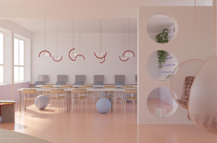
The project involves a break with the traditional classroom layout. The benches, instead of standing parallel, are arranged in serpentines; the teacher's table is blended into their layout. The benches are designed so that they can be divided into individual tables at any time. The layout seen in the visualization supports group work. It also encourages changing seats during the lesson or using the huge whiteboards on the walls. I replaced some of the chairs with rubber balls, which are intended to make it easier for children who get tired while sitting on traditional chairs to participate in lessons.
interior of the reading room
© Maria Drozd
reading room
In my design, the reading room is a huge space with a clear division into two zones: a work zone at tables and a free reading, resting zone. They are separated by a wall, which also serves as a bookshelf. In the rest zone there is a wooden platform, in which seats have been cut out. There are also small tables with lamps in the recesses. Similar lamps can be found in the composition on the wall. I wanted the reading room to be a place of concentration and tranquility.
toilet
© Maria Drozd
toilet
With the design of the toilet I show that even such a space can be visually interesting.
Maria Drozd
Illustrations: © Author


