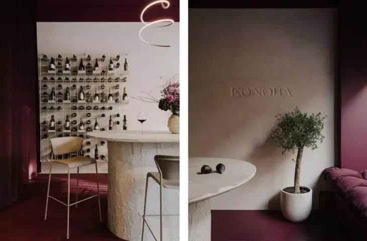
An unusual wine store, Konoba, has been created in the center of Wroclaw, Poland. The investors, in love with Croatia, approached Natalia Adamczyk of Studio N'concept to help them realize their dream of a place where people can meet, talk and taste Croatian wine. You are welcome to visit Ruska 23!
In the center of the premises stands a large table covered with mosaics
photo: Studio Resources © N'concept
We may associateCroatia mainly with warm seas, beautiful beaches and good cuisine. However, there are regions in this land that delight us with a multitude of small, family-run vineyards, run for generations with respect and love for the precious fruit. It was the sight of the vine fields and the extraordinary openness and hospitality of the hosts that sowed the seeds of fascination with this Croatian beverage in Magda and Wojtek - the owners of Konoba, says architect Natalia Adamczyk.
The wine racks are made of ribbed rods, and the lamps resemble corkscrews
Photo: Studio Resources © N'concept
conoba, that is?
The restaurant that Maga and Wojtek dreamed up was not to be just an ordinary wine store. In Croatian, the word konoba means a place where dishes and wines made from local products are served. Their family-owned, multi-generational character, traditional production methods and attention to nature, create a unique atmosphere of a place you want to return to.
The owners wanted their Konoba in Wroclaw to reflect this atmosphere in a modernized, fresh form and cultivate the same values. It was a place to meet, weave stories and celebrate Croatian wine.
© N'concept
a small place full of wine
Konoba is located at 23 Ruska Street in Wroclaw, and the real challenge for the designer was to accommodate on less than twenty-four square meters a tasting area, display area, sales area along with storage and hidden - sanitary facilities.
The main color in the interior is a deep shade of red wine
Photo: Studio Resources © N'concept
Authenticity and uniqueness provided by the work of human hands are also special values for investors and were to resonate in the interior of the premises. Hence, the key elements of the space are individual designs, created with attention to the smallest detail, in cooperation with local artisans and artists. And all of this submerged in the tones of wine purple and Croatian sands," says the designer.
The center of the premises is a monumental table where tastings are held. Its body is covered with a mosaic of broken tiles with a stone structure flushed with sand. Each piece was hand-sanded, and the roundness of the form did not make the work any easier. The table is illuminated by hanging lamps reminiscent of the shape of corkscrews. The combination with the mirrored plates adds to their lightness, reflecting the soft light and movement in the table space.
The inscription was made by imprinting the letters, and the table is covered with mosaic tiles
Photo credit: Studio Resources © N'concept
focus on detail
N' concept 's realizations are known for their refined details and lettering, and this is what happened in the case of Konoba - on the main wall finished with rough plaster is the logo of the establishment, in the form of imprinted letters.
This treatment was inspired by stone pla ques with engraved street names, characteristic of Croatia's urban landscape. Like the centuries-old plaques bitten by the tooth of time, the Konoba inscription captivates with its subtle irregularity ," adds Natalia Adamczyk.
A very important element of the premises are the wine racks, created according to the author's idea. Despite their considerable weight, they are very light in form and attached to the wall. Their structure is formed by a grid of reinforced, ribbed rods. The industrial character is softened by a light beige varnish in a satin finish.
A heavy curtain adds elegance, and the display case features hand casts of Konoba's owners
Photo: Studio Resources © N'concept
in wine color
The bright interior elements contrast with the deep wine hue. Sunk in color is both the raw ceiling and the floor, finished with tiles of intense color and uneven surface. The back room has been separated by a heavy curtain, reminiscent of those in theaters. An interesting touch is the installation placed in the storefront. From the side of the street, raised in a toast gesture, guests are greeted by plaster casts of Magda and Wojtek's hands. Symbolically heralding the life and business success of Konoba's owners.


