Do office interiors always have to be serious?
Why should they!
We invite you to the new headquarters of FORMSON—a manufacturer of plastic products. Responsible for the interior design are architects from the SPACELAB studio, who opted for strong color combinations and unusual decorations. Note the wall with thousands of silicone… kitchen spatulas.
FORMSON's new headquarters is located in Murowana Goślina
Photo: Moiz © SPACELAB
FORMSON's new headquarters is located in Murowana Goślina, and the interiors of the office part were designed by Agnieszka Deptuła and Agnieszka Małecka from SPACELAB. The company deals with plastic injection molding, carrying out orders for many industries—mainly household appliances, cosmetics, construction and interior design. The architects wanted to create unique interiors with an original, distinctive touch. So they reached for the investor's kitchen products.
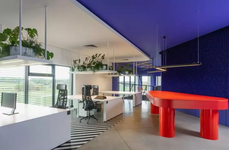
Thousands of evenly stacked navy blue spatulas form a wall
Photo: Moiz © SPACELAB
kitchen spatulas not only in the kitchen
The leitmotiv of this project became walls strewn with thousands of silicone kitchen spatulas produced by our client. The idea of using them in room design came during a visit to the FORMSON factory. As I walked past boxes full of identically manufactured pieces, I thought that hundreds or thousands of these small pieces put together would make an amazing spatial impression. Besides, they would also be a spatial advertisement of our client's production capabilities, an XXL moodboard helpful in meetings with their own contractors. We created FORMSON a designer wall, which is also a presenter of their own product,
—says Agnieszka Deptuła
chief architect and owner of SPACELAB Agnieszka Deptuła Architekt
The spatulas cover the navy blue and black walls
Photo: Moiz © SPACELAB
gradation of colors
FORMSON is mostly associated with the production of very colorful kitchen and household equipment. In their work, they test and use a variety of shades from Pantone color charts. However, against this, the architects planned the project a bit perversely. They created the entrance to the office in monochromatic colors. The staircase, corridors and elements in the employee kitchen are black.
FORMSON office, first floor plan
© SPACELAB
We were concerned with creating an entrance in contrast to the image and planning to play with the viewer only in the next step. We showed the explosion of color in the further part of the headquarters—in the work and action zones.
—adds Agnieszka Deptuła.
The staircase, corridors and elements in the employee kitchen are black
Photo: Moiz © SPACELAB
The main Pantone palette colors used are the shade Living Coral and Dark Blue 2117 C together creating a strong contrast, set against black and white. Bathroom interiors with yellow elements are an accent, while lighting in geometric fixtures, a red open sace table and the iconic RM58 arm chair in black are also eye-catching. Meanwhile, the design challenge was to hide the ventilation in the ceilings.
The Pantone palette colors used were Living Coral and Dark Blue 2117 C shade.
Photo: Moiz © SPACELAB
Cladding made of placemats
Another unusual solution in the interior of the office is on the wall of the conference room. There the architects used hot dish pads (also manufactured by the investor) to create a perforated lining.
The office part, in the background the conference room with a wall lined with dish pads
Photo: Moiz © SPACELAB
This again is an advertisement for our client's capabilities. The multiplication of these elements shows the accuracy of the manufacturing process. Each minin of the elements is equal and the same, creating a perfectly even lining
—Agnieszka Deptuła concludes.


