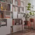
The architects managed to create an office interior that is not like any other - anonymous, built with the simplest materials. In this project you can find interior elements that relate directly to the character of the company. This not only made the space more attractive, but probably could affect the well-being of employees and their attitude to the workplace.
Architects from ASYMETRIC STUDIO created a design of an original interior in an original way referring to the character of the company. Mainly you can see it in a variety of carefully selected materials.
The space given into our hands was initially an open space of several hundred meters, and the only existing element of the interior was a grid of pillars
© Asymetric Studio
Basia Hyjek: What was the main inspiration for this project?
ASYMETRIC STUDIO: The desire to relate to the company's profile in a non-obvious, synthesized way - the office is involved in designing floating structures of various scales. The use of steel and rounded elements was a natural association, which, used consistently, allowed us to lay out the space, giving it an orderly yet unobvious look.
Basia: What were the investor's expectations?
ASYMETRIC STUDIO: The investor contacted us at a stage when he was planning to change his old headquarters into a much larger one due to the company's growth. The space given to us was initially an open space of several hundred meters, and the only existing interior element was a grid of columns. We began our work by delineating clear circulation routes, and then divided the space into an open part (designers' workspace) and a separate part (conference rooms, canteen, checkroom, CEO's office and technical rooms).
The palette of colors used, mostly in subdued colors, is broken in a few points with intense red to give dynamics to important elements
© Asymetric Studio
The investor wanted the space to be comfortable and visually interesting, yet different from the current standard of office interiors. The requirement was to expose the existing structural elements, for which he has a weakness. He wanted them to be an integral part of the resulting design - hence the exposed ceilings and unplastered columns visible in each room. In addition, the designed installations were not obscured by a suspended ceiling, further enhancing the "technical" appearance of the whole.
Basia: Where did you get the idea for such a selection of colors and materials?
ASYMETRIC STUDIO: Much of the furnishings were created specifically for this project - such a solution allowed us to control the entire premise. In this way, all the built-in and free-standing furniture, steel elements in the form of interior glazing and lamps and details such as handles and handles were created, ending with the visual identification of the rooms. The palette of colors used, mostly in subdued colors, is broken at several points with intense red to give dynamics to important elements. Laminates in dim colors, corrugated MDF boards, bleached pine plywood, lacquered steel profiles or reinforced glass are just some of the materials that can be seen in the presented interior. The whole was complemented with plants, omnipresent in every corner of the office.
A considerable part of the furnishings was created especially for this project
© Asymetric Studio
Basia: What was the biggest challenge in creating this project?
ASYMETRIC STUDIO: The biggest challenge was to design a coherent and attractive space on a large footprint, while having a fairly limited budget.


