The architects faced the challenge of designing a dental clinic in Toruń. Their goal was to disenchant a visit to the dentist as an unpleasant experience. The interiors of Dentomania are meant to put patients in a positive mood before the procedure. The design is dominated by colors from the range of petrol and navy blue due to the clinic owners' love of sailing.
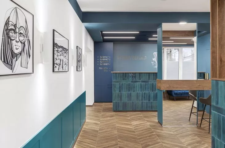
Architects from the MAKA.STUDIO studio created an interior that is truly friendly to patients waiting to see the dentist. Fear can be alleviated not only by deep shades of blue, but also by friendly, "nautical" graphics created by Marta Plusa. Here, the colors of the sea tones correspond with the walnut wood of the sailboat decks, transporting patients to the middle of calm waters.
The designers based the functional layout of the interior on clear zoning, which they articulated with spots of color. The waiting room and reception area are dominated by navy blue interspersed with petrol. As the architects themselves say - they immersed them in the depths. In the circulation area, as well as in the medical area, white dominates.
An important element of work on this project was cooperation with graphic designer Marta Plusa, who closed our vision and the preferences of the investors in her works, thus creating graphics that are an important part of the project
Photo by Tom Kurek
Basia Hyjek: What was the main inspiration for this project?
MAKA.STUDIO: First of all, our inspiration was to get to know the investors better, their approach to work and their passions. The second factor influencing the character of the space was the desire to create interiors that were original, dynamic and hit the tastes of patients of different ages. An important element of work on this project was cooperation with graphic designer Marta Plusa, who closed our vision and the investors' tastes in her works, thus creating graphics that are an important part of the project.
Basia: Was it problematic to give the space a new function?
MAKA.STUDIO: We take a very individual approach to each project. Changing the use and coming into contact with the existing fabric of the building is a natural and inevitable part of many projects. In our studio we try to translate spatial, structural limitations into creative and unusual solutions that will satisfy the client not only aesthetically, but also functionally.
We did not want to refer to the chosen theme in an obvious or banal way
Photo: Tom Kurek
Basia: Where did you get the idea for such a combination of patterns, colors, graphics?
MAKA.STUDIO: Our need to create interiors that are original, dynamic and hit the tastes of patients of different ages led us to search. We did not want to refer to the chosen theme in an obvious or banal way. This is also not our first project in a nautical theme, and yet we have not yet used blues, navy stripes or anchors to express this. Through observation, we managed to capture the phenomena of the sea and sailing in the interior, in a rather unconventional way. The counter or sections of the partitions finished with glazed tiles in two different shades evoke the depths of the sea and the reflections, so easy to observe on the surface of rippling water. Bold color and graphic combinations work well together and please the eyes of users of all ages.
Basia: What was the biggest challenge, and what gave you the most satisfaction in the whole process?
MAKA.STUDIO: The biggest challenge in the design was the balance between the rather bold vision of the interior and its main function. We were concerned not to unbalance, not to overwhelm the medical spaces (sterile, spacious) with a rather characterful and full of dynamism interior of the waiting room and reception area.
Waiting, in the assumptions of the project, was to take place in a pleasant, cozy and interesting space
photo by Tom Kurek
The entrance was meant to break with the usual patterns well known from waiting rooms, where some patients find it hard to stand with their own fears before visiting the dentist. Waiting, the project intended, was to take place in a pleasant, cozy and interesting space.
The greatest satisfaction for us are the messages from satisfied investors, who feel like "fish in water" in the interiors of the clinic we designed, and the positive reactions of patients who appreciate the ingenuity of our project.


