The {tag:studenci} from Poznan University of Technology took an in-depth look at the buildings we live in during the pandemic. At the time, they became multifunctional spaces for work, study and recreation, but not every square footage could handle so many tasks. A student of architecture, wanting to solve this problem, proposed the House on Debinska Street - a multi-family building, consisting of comfortable apartments with different areas and layouts adapted to the residents and their needs.
TheHouse on Deb inska Street is a work that was created in the third year of studies, under the direction of Professor Piotr Marciniak.
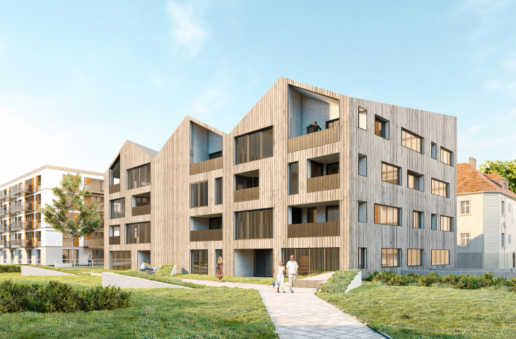
The house on Debinska Street is surrounded by villas and a modern estate
© Paulina Otto
The coronavirus pandemic has undoubtedly affected every area of our lives - from health aspects to work to interpersonal relations. Just after a month of the first lockdown, many people forced to work remotely began to feel unwell in their apartments and discovered shortcomings they had not paid attention to before. Houses and apartments ceased to function only as bedrooms, they also became places for work, study and recreation at the same time. It turned out that not every square footage can handle so many tasks at the same time. But isit precisely the question of the size of the premises that is most important? - Paulina Otto wonders
In response to this question, the student created Dom na Dębińskiej - a multi-family building consisting of apartments of different meters and layouts. The author's goal was to create a "living machine." However, not one designed for the modulor, but a universal one, for ordinary people who differ in their needs, degree of physical fitness and lifestyle.
The project plot is located on Drodza Dębińska in Poznań
© Paulina Otto
A neighborhood full of contrasts
The plot of land intended for the designed facility is located in Poznan on Drodza Dębińska Street. It is a place full of contrasts - despite its proximity to the city center, it is relatively quiet and there is a lot of greenery - both high and low. The predominant buildings are multi-family houses with compact rectangular blocks and a few urban villas with multi-pitched roofs. Their light-colored facades have rustications, the simple masses are enriched with apses, and the entrances to the buildings are emphasized with high staircases and decorative portals. Interestingly, a modern River Park housing development has sprung up in the area, with buildings of simple forms, flat roofs and modern elevations (glass balustrades, panels imitating wood, etc.) According to the MPZP, the object designed on the plot selected by the student should have a sloping roof, as a continuation of the urban villa theme. In addition, the green belt running between the C-shaped buildings of River Park should be preserved as an undeveloped continuation.
The buildings in the area are urban villas and the River Park development
photo: Paulina Otto
archetype of the house
The author began her design by looking at and using the archetype of the house. According to her, the multiplication of the archetype is supposed to mean that the designed object is a multi-family house. The sloping roof itself was imposed in advance by the Local Development Plan, but its overall form was not, so the designer opted for a multi-pitch roof, whose slopes are inclined at the same angles, but alternate. As a result, the gables of the front and rear elevations do not overlap, while the roof when seen from the front resembles a characteristic crown.
The proportions of the building are more similar to the neighboring villas than to the blocks of the River Park estate.
The building's slanting roofs form a distinctive crown
© Paulina Otto
scandinavian lifestyle
The first floor of the building is intended for services. The author was inspired by the designs of Alvaro Aalto and the Scandinavian lifestyle - spaces for taking care of the hygiene of the mind and the health of the body were found here. The eastern part was occupied by a well-lit library with a work zone. The western side of the first floor was dedicated to a small swimming pool and sauna for the residents of the estate.
The first floor includes a library, work space and a small swimming pool and sauna
© Paulina Otto
An important element of the first floor is the solid waste management room - the size of the entrance door was adjusted not only to the technical conditions, but also so that containers with garbage could be brought out. Locating this room on the first floor of the building not only removes the risk of chaotic small architecture on the plot, but also makes life easier for residents. Also, the facade is partly made of wood - Siberian larch as the main cladding fixed on a steel grate with visible nails, burled wood used on the balustrades and architectural concrete in the recesses is a reference to the Scandinavian style. Each elevation has a completely different appearance generated by the spacing of balconies, loggias or their complete absence.
The building consists of three floors
© Paulina Otto
"living machine"
The building consists of three floors, and on each floor there were five completely different types of apartments - from studios to four-room apartments. It was important to the author that each apartment be the "machine for living" mentioned at the beginning, so the design process consisted of a thorough rethinking of the universal pattern of a day in pandemic, a situation in which all the time is spent in the apartments.
The house on Dębińska Street, floor plan of level 1 and 3
© Paulina Otto
The most important thing for me was to design a building that would be associated with home. Ever since I moved to Poznan to study, I was lacking space, and each successive apartment seemed strangely alien, everything was crammed together, but generated more clutter, so when designing apartments, I tried to keep in mind storage spaces, and prepared apartments with distances adapted for the disabled. I adjusted the bedsits so that a student could live in it as well as a professor. I planned the residents' lives from entering the apartment and pulling on shoes to cooking dinner and watching a family movie to going to bed. The pandemic during which this project was created inspired me to make these apartments not prisons, but more than a home, perhaps a little "living machine." Each apartment included a desk, because who knows when remote work will return again? - explains autroka.
The right space
The author took care to zone the space of each apartment. The bright kitchen, although open and usually connected to the dining room, is a separate zone, separated from the restful living room and bedroom. In studios, the kitchen directly connected to the dining room, and the kitchen table can also serve as a worktop. Bedrooms have ample storage space, and some have separate study areas. The sanitary rooms are designed to rest on the interior walls of the building.
House on Debinska Street, cross-section
© Paulina Otto
Two apartments on each floor are adapted to the needs of a wheelchair user. In addition, each apartment has designated space for a washing machine in the bathroom and for a bathtub and shower. This is to meet both the needs of elderly people who have trouble getting into the bathtub and parents of young children, who find it easier to bathe a toddler in the bathtub than bending down in the shower.
Balconies resemble pull-out drawers
© Paulina Otto
balconies like pull-out drawers
Each apartment is equipped with a sizable balcony and/or loggia surrounded by opaque balustrades, which stand out in color from the facade and give the effect of alternately protruding and retracting drawers.
I tried to make the balconies and loggias larger than average - allowing not only for ventilation of the apartment, but so that one could sit comfortably on them and stretch one's legs or at least take out the dryer with laundry [...]. I opted for closed balustrades made of burnt wood, which are an important element of the facade, because they not only balance the loftiness of its proportions, but also constitute a game - they are like drawers that someone has haphazardly knocked together to create a composition. I considered calling the project Koronahouse because of the fact that the roof forms a very distinctive crown, but also because the coronavirus was an important starting point for me - it was through it that I tried to design so that the apartment could meet every need, Paulina Otto concludes.


