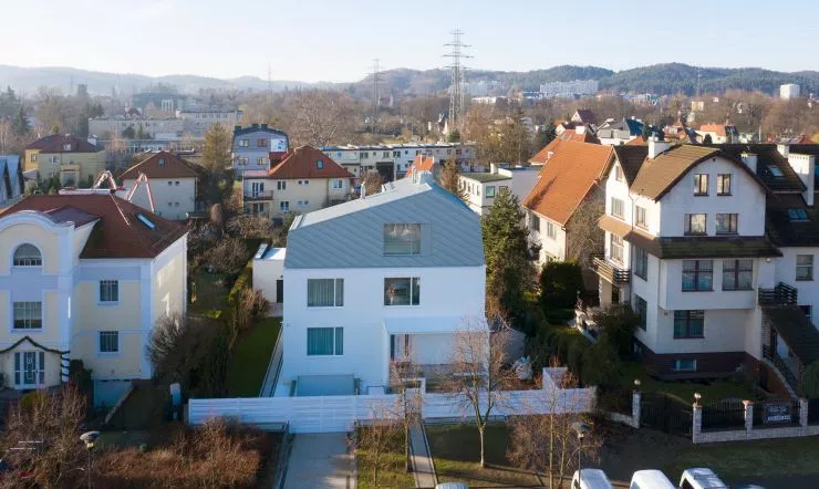
The roof, through its shape, color or the materials used to finish it, can add variety to almost any block. And it was on the fifth elevation that the greatest emphasis was placed by architects from the Gdansk studio IFAgroup in the design of a house located in the geometric center of the Tricity.... with a cap!
The 


house with a cap is located in gdansk's villa district
Photo: Sebastian Malyszczyk
The 290-square-meter house is located in Gdansk's villa district. Although in terms of dimensions it fits in with the neighborhood, it is distinguished by its minimalist form and the geometric shape of its light-colored roof. The minimalism of the body, according to Kamil Domachowski, an architect from IFAgroup, emphasizes the smooth transition of the roof plane into the wall plane, and the tin "cap" superimposed on the building optically reduces its dimensions. The house, the architect adds, is as if carved out of a single, snow-white block; even the window and door woodwork is white (only the windows in the top floor match the color of the roof).
Left: west elevation; right: east elevation
© IFAgroup
Designed on a rectangular plan, the building on the first floor level on both sides (from both the street and the garden) is enlarged by additional zones - the entrance, whose canopy refers to the shape of the roof and the terrace - with a glazed winter garden.


view from the garden side
Photo: Sebastian Malyszczyk
Ola Kloc: What was the priority for investors?
Kamil Domachowski: Our task was to design a solid, the function was previously delineated. For investors, the priority was an interesting, contemporary idea, a modern body of the house. It started with the fact that we were supposed to design another, smaller order, but the investor mentioned that he was planning to build a house and I couldn't help but get interested. We were given a specific time to prepare several concepts and managed to convince him of our vision.
Ola: The house was built at the junction of two neighborhoods with different buildings - historic and modern, how did such a neighborhood influence the shape of the house?
Kamil: The investor wanted to live in a modern house, and the plot is located among - among other things - historic buildings. As a result, the form of the house is a contemporary interpretation of the historic blocks from the neighborhood, mainly due to the mansard roof done in a modern way, without eaves and with sheet metal covering in a crooked standing seam.
Left: west elevation; right: east elevation
© IFAgrou
Ola: The cap house, as you mentioned, is covered with a titanium-zinc sheet roof, which resembles the shape of mansard roofs in the modern version. What is the reason for its irregular shape?
Kamil: The house stands between two buildings, one of which is lower and the other higher than it. The size and shape of the roof are due to the line connecting these two neighboring buildings. Because of this, the mansard roof crowning the house is crooked.


silhouette of the building from the street side
© IFAgroup
Ola: What was the most difficult part of this project, and what are you most satisfied with?
Kamil: We attempted to create a solid that is timeless and fits into the context of the existing surroundings. Its form enters into a dialogue with the neighboring buildings on the frontage, entering into a relationship with them. The house is modern, but it does not overwhelm, but rather subtly fits into the context of its surroundings. The result is as designed - this is what we are most pleased with. Also from the fact that the investors were open to ideas and trusted us, so it could work.
Ola: Thank you for the interview.


