Anew waiting room in the place of a neglected modernist Gdansk bus station is a proposal by Barbara Klimek, a graduate of interior design at the Academy of Fine Arts in Gdansk. The author, applying the principles of space psychology and numerous sensory impulses, created an interior worth spending time in.
The work, done under the direction of Tadeusz Pietrzkiewicz, PhD, is a proposal that could increase interest in Gdansk's neglected bus station. Transforming the facility into the city's waiting rooms will increase its functionality by adding new services - catering, coworking, accommodation and exhibition.
The new waiting room is a place to spend time pleasantly
© Barbara Klimek
According to the project's author:
Theenvironment affects people the more strongly they are insecure. Therefore, it is important to provide them with a sense of security. Even the most impressive architecture will not become a place frequented if it is an anti-people place. A huge influence on the sense of belonging to a place is urban planning. It is space planners who should shape the composition of cities. The lack of respect by developers and authorities for the field of urban planning has contributed to the disruption of the composition of cities. One may ask whether it is possible to reconcile the desire to chase Western architecture with simultaneous attention to the local historical context? Gdansk's modernist buildings from the 1950s-70s have largely become neglected, so the city is making calculations - to demolish or to preserve? In such a position for many years has been the Station of State Automobile Transport in Gdansk.
The city's waiting room at the site of the former PKS station
© Barbara Klimek
city waiting room
The design of the waiting room draws attention to respecting the cultural heritage of undervalued architectural objects of yesteryear. The author, deciding to make changes to the functionality and appearance of the interior of the building, hopes to save the modernist volume, but also to create a showpiece for the city. Changes to the station's interior were analyzed in terms of the psychology of the space and sensory impulses, so that visitors would feel safe and comfortable.
The author tried to create the place in terms of the psychology of space
© Barbara Klimek
color, light, divisions - visual impulses
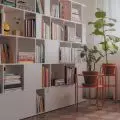
The interior of the station was built with both matte, satin and glossy surfaces. All this is done so that the light coming into it, depending on the time of day and year, had varied colors. The entire space is built up by large sheets of glass and monumental white planes, interspersed with simple shapes of pendant structures. Through the use of white and steel, the design is kept in the original style of the 1970s. The building is dominated by pure, monochromatic colors, accented by orangish and green plants. The author used new materials in the form of chrome panels for the elevator shaft casing, concrete on the floor. White-gray terrazzo forms stripes on the floor, marking possible directions of "sightseeing." Other materials - stone, wood, steel and ceramics refer to the former design.
The designer chose to use a variety of materials
© Barbara Klimek
textures - tactile impulses
Tactile, meaning anything that is touched or sat on. The designer chose to vary the materials, aiming to stimulate sensory cognition. She juxtaposed hard wooden chairs, platforms and plastic hockers with soft upholstered seats and backs. The walls are decorated with smooth ceramic tiles, matte terrazzo, soft-touch wooden laths and rough cork. Ubiquitous plants add to the softness of the interior.
The new facility also includes hotel rooms
© Barbara Klimek
acoustics and sounds - audio pulses
The interior of the station is open, so it was necessary to focus on its acoustics. Barbara Klimek used baffles to create a subtle sound barrier in the form of plant hangers, allowing pictures or graphics to be hung. Noise-dampening acoustic panels made of cork were provided for the coworking area . On the other hand, on level -1 the author created a space for musical performances.


