The Tysiąclecia estate in Katowice is one of the best-known developments by the architect duo of Henryk Buszka and Aleksander Franta. The estate on the border between Katowice and Chorzow, which was eventually to house 45,000 people, is built up mostly with point-blank skyscrapers, the most recognizable of which are the characteristic "cornucopias" from the 1980s. In one of the blocks of apartments in the famous housing development, architects from the Kolorarchitektura studio designed a reconstruction of an apartment, whose streamlined aesthetics are meant to refer to the character of the large-scale slab.
The original layout of the apartment was characteristic of one of the three types of blocks on the estate - it had a narrow and closed kitchen, four small rooms and a reinforced concrete load-bearing wall dividing the apartment into two parts. Despite its relatively large size, according to the project's authors, the apartment seemed cramped.
The solution, which helped get rid of the feeling of crampedness and reduce the number of unnecessary nooks and crannies, was to rely on the mobility of some of the partitions. Thanks to the sliding walls, it is possible to combine individual zones or separate them as needed, write the authors of the concept, architects from the Kolorarchitektura studio.
axonometry
© Kolorarchitektura
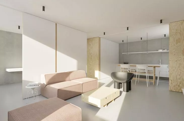
Although the apartment's square footage has not changed, the interior gives the impression of being more spacious. In the depth of the apartment, in the part away from the windows, the so-called "dirty zones" - the bathroom and hallway - were created, and along the windows - the sunlit areas where the residents spend the most time - the bedroom, living room and office. The architects combined the kitchen with the living room, which were originally located at two ends of the apartment, allowing for a bright living area.
The minimalist interior primarily uses white, exposed concrete on the walls and pine plywood, which was used to create mobile partitions that separate and open up the various zones.
Individual spaces are divided by sliding walls
© Kolorarchitektura
Ola Kloc: What was the main inspiration for creating this interior?
Agata Wolna: As always with renovations, our goal is to increase the quality of use. First of all, we focus on functionality and adapting - in this case, the interior - to today's standards. Aesthetics are also important, but they are largely a consequence of the aforementioned activities. When designing, however, we keep in mind that the atmosphere of the apartment should be consistent with the place where it is located. This time it was a housing development built in the second half of the last century.
Ola: What were the needs and requirements of the investor?
Agata: The investor's priority was to combine the living room with the kitchen, leaving the possibility to separate the space. He also wanted a large and comfortable bedroom and a separate study for work.
View from the living room to the hallway and study
© Colorarchitecture
Ola: What was the biggest challenge, and what gave you the most pleasure during the design process?
Agata: It was a challenge of sorts to design an apartment with a contemporary character, while preserving the atmosphere of the Great Plateau, and avoiding the typical furniture associated with that period. Realization of the investor's requirements brought us satisfaction.
