This building combines many, often contradictory aspects - history with modernity, extremely different expectations of a pair of investors, two functions and, finally, two types of habitation - a single-family house and a familok, well-known from the Silesian landscape.
In Zabrze, on a plot of land surrounded by brick, unplastered familoks, i.e. multi-family buildings originally intended for heavy industry workers, on which a residential townhouse was previously located, architects from the BAAR studio designed a single-family house with an office. In creating Domofamilok, as they themselves say, they killed two birds with one stone. What challenges did they face? What inspirations characteristic of Upper Silesian architecture did they reach for? Adam Radzimski of the Zabrze-based BAAR studio answered these questions.
Ola Kloc: You called the project "Domofamilok", tell us, please, more about the name itself.
Adam Radzimski: That's right, for us this name is very natural, it consists of two members - a house and a familok, and the project is a conventional transformation of a familok, that is, a multi-family residential building into a single-family residential house. We can't imagine that this project could be called anything else ;)


solid shaping scheme
© BAAR
Ola: What elements typical of Silesian architecture can be found in this project?
Adam: The main element typical of historic Silesian mining architecture is, of course, brick and the single-layer walls created from it. We managed to preserve their character by using contemporary three-layer technologies. In places of glazing, the exterior walls "enter" the interiors - inside and out you can see the uniformity of the material used. In the project, intentionally all windows are installed on the inside of the wall, to emphasize the effect of thickness and uniformity of the walls.


view from the garden side
© BAAR
In addition, the building is characterized by the simplicity of its body and facade. Orderly repetitive rhythm of windows, lack of superfluous ornamentation... these are the characteristics of low-rise buildings - familoks, where mining families used to live.
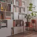
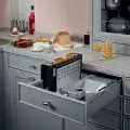
As a material we used the most classic of classic bricks, the production of which has not changed for centuries. In designing the interiors, we also drew from the traditional interior architecture seen in Silesia, using such built-in elements as the kitchen sideboard.
The 


interior of the house
© BAAR
Ola: What was the investors' priority?
Adam: Here we will say frankly that the beauty of this project lies in the combination of contemporary and historical architecture, because as architects, of course, we design in the spirit of the times, but in this case we also have a certain established urban and historical context, to which we could not remain indifferent.
And in practice this would have been enough, but in this project we were lucky enough to meet investors with different stylistic tastes. She loves modern architecture, and he loves traditional architecture. They came to us after an experience from another architect, who, unable to get out of the situation, created two completely different designs for them - one tailored to her, the other to him. They were supposed to choose which one they wanted to pursue, and unable to make a final decision, they started looking for a different style.
We knew that combining different styles was ok, that it could be reconciled, and we created a house design in which they would both feel comfortable. Ultimately, we killed two birds with one stone.


cross section
© BAAR
Ola: What influenced the final shape of the lump and the "cutting off" of one of the exterior walls?
Adam: The lump is simple in its form - rectangular just like classic familoks. The only change is the replacement of the "flat" roof, characteristic of residential tenements, with a gabled roof more characteristic of single-family houses... it couldn't have been otherwise, as we were finally changing a tenement into a house.


first floor plan
© BAAR
Just cutting off one of the walls is due to the function. The main one is, of course, a single-family house, but an additional one is a home office - a small law firm to be housed in the facility upstairs. We knew that we needed to produce a visible, eye-catching separate entrance to the additional function, but we also did not want to destroy the homogeneous perception of the building, and just "cutting off" one of the walls seemed to us the ideal solution in this case. In the resulting space we placed the staircase to the first floor to the law office.


floor plan
© BAAR
Ola: What was the most difficult part of this project, and what are you most satisfied with?
Adam: The most difficult part was satisfying the different tastes of the investors. Convincing them of the chosen style, opening them up to the mining architecture of Silesia, which I don't think they expected in this project. We are most pleased that they trusted us and we were able to go in this direction. And, of course, the fact that we felt that the final result was a project that was, let's call it, "strongly consistent", which met the assumptions we made - it reconciles history with modernity.
Ola: Thank you for the interview.


