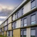
The single-family Cut House, designed by architects from KUMstudio Łukasz Skorek, was built in the center of Cracow. The distinguishing element of the minimalist body of the building are light-filled slits running through the facade and flowing into the interior of the house.
Photo: Paweł Ulatowski
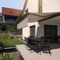
The body of the house, with an area of almost 600 sqm, is formed by three staggered cuboids. The withdrawal of the middle block made it possible to create a large terrace clad with wooden panels contrasting with the raw concrete "skin" of the facade. The gray exterior walls of the house are intersected by straight vertical and horizontal cuts, as well as the building's characteristic narrow lines of light, running at different angles.
longitudinal cross-section
© KUMstudio Lukasz Skorek
Residential functions were introduced byarchitects from KUMstudio Łukasz Skorek on the upper floors - the second floor included an open kitchen with dining area and living room with access to a terrace, while the third floor included bedrooms and bathrooms.
Ola Kloc: What was the priority for the investors?
Lukasz Skorek: Probably good and substantive cooperation with the architect. Talking, together we motivate each other to think and let this project come into being. Functional or aesthetic decisions are a derivative of these conversations, and over time, an intermediate step already forgotten.
Photo: Pawel Ulatowski
Ola: What was the biggest challenge, and what are you most satisfied with?
Lukasz: The house was built in the center of Krakow, that is, in a rather intense urban area. Adapting the facade of the building, illuminating the interior and creating views from the inside to the surroundings and, in turn, confronting this with the private aspect of a single-family house in the context of the neighborhood - I think this was the challenge, which is one hundred percent unpredictable until the building is built. Visiting the building, I am convinced that we succeeded.
Photo: Pawel Ulatowski
The effect is what fulfills us. In this case, the outer, penetrating skin of the building captures the essence of our project. We get the greatest satisfaction when we manage to realize our idea to the end; always with some changes and compromises. A detail that is not always noticeable, but worked out, makes me feel good about the finished and planned work. It's great to realize an object with different aesthetic qualities.
Ola: The name of the house - Cut House - refers to the artificial cuts on the facade, what was the inspiration for such a solution?
Lukasz: Intentional interference, deformation of what is rational, functional, straightforward and planned.


