We take a look at the newly renovated interior of the Poznan office of advertising agency GPD, designed by Bidermann+Wide studio. The architects, in order to meet the requirements of a dynamically growing team of nearly 200 employees, proposed interesting acoustic and ergonomic solutions. The office features spaces for creative one-on-one and group work, intense colors and biophilic design.
We cared immensely about the social perception of the project, i.e. that the team really enjoyed working here. We tried our best to make daily life comfortable and to create the right ecosystem for work, so among other things, to ensure high air quality [...]," says chief designer Maciej Bidermann.
office with a view of Poznań
Photo: Hanna Połczyńska |Kroniki Studio © Bidermann+Wide
Why did the agency decide to renovate its office? Previously, it lacked a social area with a kitchen and a relaxation space, but it also lacked places to hold more-or-less formal meetings. In addition, GPD asked for a projection room.
A characteristic element of the office is mobile furniture with rounded shapes and colorful meeting rooms
Photo: Hanna Połczyńska |Kroniki Studio © Bidermann+Wide
We consider the introduction of all these functions and the comfortable distribution of almost two hundred creatively working people on 1350 square meters a great success," the architect adds.
A cinema hall with wooden steps forming an auditorium
Photo: Hanna Połczyńska |Kroniki Studio © Bidermann+Wide
open space, hot desk and cinema room
To accomplish this, the architects divided the floor occupied by the company in half. Between the resulting two open spaces(green and red), a common space was created, surrounded by a wide passageway, as the authors say the bloodstream of the company. In addition to a lobby with a reception area with a distinctive gladiator sculpture, the central part of the office included a kitchen with a café area, a long table to integrate employees and several small tables, as well as a hot desk. A step further on, separated when necessary by a black curtain, appeared a cinema room with wooden steps forming an audience.
hot desk
Photo: Hanna Połczyńska | Studio Chronicles © Bidermann+Wide
colorful meeting rooms
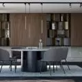
The office also had meeting rooms of various sizes, both closed and semi-open in the form of upholstered niches with tables and seats. The largest, a twelve-person meeting room, has increased acoustic parameters, conducive to longer video calls, and appropriate electronic equipment. There were also booths for phone calls in the vicinity.
Colorful, semi-open meeting spaces
photo: Hanna Połczyńska |Kroniki Studio © Bidermann+Wide
attention to acoustics and reverberation reduction
The agency's headquarters is located in an office building that is not the youngest, so attention to acoustics and reverberation reduction were important. They are served by a number of multifunctional mobile furniture visible among the desks. The fixtures, in addition to organizing the space, serve as a bookcase, bench or whiteboard, for example. In addition, the space is muted by curtains and carpeted floors in the conference rooms, which, like acoustic panels, absorb noise. The wooden floor, visible in various parts of the office, was left from the previous design and renovated in the spirit of environmental awareness.
The architects introduced vegetation into the interiors
Photo: Hanna Połczyńska | Kroniki Studio © Bidermann+Wide
friendly space
The architects decided to leave the wooden floor and the long table (today a hot desk), elements from the previous design of the space. WELL building certification standards and biophilic design were important aspects throughout the project. Among other things, the designers used appropriately selected plants that serve not only to decorate the interiors, but also increase oxygenation and humidity parameters and reduce stress, and provided access to fresh, filtered drinking water.
The color scheme and furnishings are meant to encourage creativity
Photo credit: Hanna Polczynska | Studio Chronicles © Bidermann+Wide
Also read about ways to furnish an interior in the biophlic design trend.


