In the design of a spacious apartment in a tenement, Magdalena Koz iej and Michal Koziej of the koziej architekci studio in Lodz put into practice the 3Rs principle, i.e. reduce, reuse and recycle. See what the results are!
floor plan of an apartment in a townhouse
© koziej architekci
Ola Kloc: The apartment is located in an old tenement - what were the challenges of working with the historic fabric? Was it necessary to change the functional layout of the interior?
Magdalena Koziej: We are fans of interiors in tenements, they are inspiring just like combining the old with the new. We very much want to use the potential of secondary market apartments, especially apartments in tenements. These buildings are already standing, they need to be put into use, adapted to current needs, they can become very comfortable apartments. And then there's the location! After all, most of the best plots of land in the city are already developed. A good location makes it possible to realize the concept of a 15-minute city.
In projects where we are dealing with historical interiors, we usually combine new furniture or furnishings on the basis of contrast, the new is an implant.
The goal of the architects was to use the potential of a secondary market apartment
photo: Mood Autors Pawel Marcinkowski
We adapted the functional layout to the needs of the residents (a family of 2+2). There are two bathrooms in the apartment, one for the children accessible from the hallway, and the second bathroom, for the parents, is accessible from the bedroom. This bathroom next to the bedroom is connected to the dressing room. The kitchen is also not in its original position. We moved it to one of the rooms along with a comfortable table for the whole family. The apartment is divided in a very clear way into a common area and a private area. There was no demolition, the wall layout is original. We added one wall in the parents' bedroom to create a bathroom with a dressing room.
The layout of the walls remained unchanged
Photo: Mood Autors Pawel Marcinkowski
Ola: The apartment is full of used furniture and original accessories, what inspired you to make such choices?
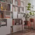
Magdalena: We are interested in young antiques, history of interiors and design. We appreciate a good product, we are happy when a product manages to give a second life. Some of the furniture in this apartment is designed and custom-made by us, such as the kitchen, closet and bathroom furniture, but a large part of the furniture, is "second-hand" furniture, young antiques. A gem is a Rajmund Halas bookcase from the early 1960s, which is highlighted with accent lighting. We were lucky because the bookcase, along with the table and chairs from the 1329 set, were inherited.
Table and chairs designed by Rajmund Halas, part of the Type 1329 combination set and bookcase from the early 1960s.
Photo: Mood Autors Pawel Marcinkowski
Ola: You were not afraid of dark colors in the interior - dark green dominates in the kitchen, and black in the bedroom. What should you keep in mind when introducing these kinds of colors into your apartments?
Magdalena: Our intention was to make the kitchen a strong accent built on the contrast to the old tenement interior. The color is chosen intuitively, we felt it would work well. The kitchen is a new function in this place, we wanted its form to be alien, we further reinforced this with color.
Dark colors in the kitchen and bedroom
Photo: Mood Autors Pawel Marcinkowski
The room where the bedroom was planned is very bright, with a large window, so we were not worried that it would be too dark. We wanted to use black clay plaster, because we really like this material. In addition, we wanted to bring a muted, cozy mood to the bedroom, which we knew we would achieve by using a dark color scheme. A large decorative role in the bedroom is played by the wallpaper, in addition, it is designed to mask well the bathroom door next to the bedroom. The bathroom is connected to the dressing room, so that, we avoided the closets in the bedroom.
In this project we tested clay and its possibilities, colors, texture, pigments, durability. We did a lot of testing, we tested different manufacturers. Black in this edition delighted us.
Ola: What are you most satisfied with in this project?
Magdalena: The project was developed according to the 3R principle - reduce, reuse, recycle. The idea of the 3Rs is realized both through the use of used furniture, but also a "used" apartment, but equipped with modern installations and appliances.
We used clay plaster over existing brick walls. In addition, we reduced the use of construction chemicals. We chose low-emission paints for painting the ceilings. We decided to use clay plaster after gaining experience in previous projects with natural materials, even though they were single-family homes designed in our studio, they proved how beautiful thismaterial and how much it can bring to the interior aesthetically, and the appearance is its side feature, because, above all, clay plasters introduce a very good microclimate in the interiors, they are natural, so we do not stay in the fumes of construction chemicals. Ever since we got to know them and saw how they look in the interiors of "our" natural houses, we dreamed of combining their rough, picturesque texture, with noble stucco ceilings in a townhouse. We were waiting for an opportunity to show that old buildings made of natural low-processed raw materials have great potential for creating a friendly place to live in accordance with nature, which, as in the case of this apartment, has the surface area of a small detached house - 120 square meters.
living room and bedroom
Photo: Mood Autors Pawel Marcinkowski
The natural beauty of the plasterwork is accentuated by the lighting, which offers adjustable intensity. The luminaires used use DALI technology, the apartment is equipped with a KNX control system.
Ola: Thank you for the interview.


