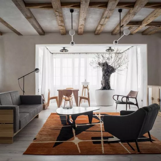
The architect created an apartment for a family of four in Zabłocie, based on the color scheme from Adam Wątor's paintings. Delicate colorful tones resound not only in the pillows on the sofa, but also on the kitchen floor in the form of a mosaic and in small elements of the interior design.
Ewa Tarapata of Ewa\Studio Interiors was inspired by the paintings of a Polish artist when creating the project, which resulted in a colorful but subtle interior of an apartment in Krakow's Zabłocie district. The original layout of the rooms, proposed by the developer, was completely changed and adapted to the needs of the residents.
Basia Hyjek: What was the main inspiration for the project?
Ewa Tarapata: Adam Wątor's paintings in the living room and kitchen were the main inspiration for the design of the apartment. The colors from the painting were used in the interiors, as was the gray shade of the specially selected tiles, reflecting the color found throughout the interior.
The wall behind the bed and leading to the bathroom and dressing room was covered with a beautiful wallpaper depicting the starry sky, moon and clouds in blue and green shades, providing the perfect background for the green furniture
photo by Katarzyna Wrona
Basia: Where did the idea for such a division of space come from?
Ewa: The interior of the apartment was to serve a family of four. So there were three bedrooms, two bathrooms, a laundry room, a dressing room and a living room with a kitchen and dining room. The bedroom of the adult household combined with the dressing room and bathroom is an oasis of calm. I spotted the green bed in a brilliant show room in Cracow. It stole my heart and had to become the main furniture in the room. Its original color made designing the bedroom not easy. I strove to emphasize its qualities and at the same time not overwhelm it. The wall behind the bed and leading to the bathroom and dressing room was covered with a beautiful wallpaper depicting the starry sky, moon and clouds in blue and green shades, providing the perfect background for the green furniture. The bedroom has been further developed into a work space.
The living room with the kitchen is designed so that everyone can live comfortably. Here, too, there is a projector and a screen where the whole family can watch movies without having to go to the theater. In the kitchen, on the other hand, a great deal of worktops have been installed, as the household likes to cook.
Adam Wątor's paintings in the living room and kitchen were the main inspiration for the apartment's design
photo by Katarzyna Wrona
Basia: What was the biggest challenge in creating this place?
Ewa: The design of the apartment was completely changed. Not even a trace remained from the developer's concept. The biggest challenge was to create a living room with a kitchen and a dining room in a room that was a 6 × 6 m square with lots of windows. However, it worked out perfectly! Another challenge was to place the children's rooms next to each other and to use the space to separate a bedroom with a bathroom in another part of the apartment. In addition, separating the laundry room and multiple storage areas throughout the apartment.


