In the design of the interior of an apartment located in one of Warsaw's townhouses, the designer referred to its distinctive 1920s architecture. The inspiration can be seen not only in the selection of some furniture, but also in the reproduction of the shapes found on the building's facade. To do this, the designer had to almost completely remodel the interior.
Monika Gruszka-Ziółkowska of the luumo. studio created an interior balancing between modernity and modernism . The result is an elegant space that does not lack character.
Basia Hyjek: What was the main inspiration for the project?
Monika Gruszka-Ziółkowska: The apartment was designed with a 2 + 1 family in mind, it was created by combining two smaller units. The owners showed a lot of imagination when deciding to buy - despite the fact that the apartment is located in a pre-war building, at the time of starting the design work the interior did not refer to the historical past of the place in any way. In order to restore the atmosphere of the old tenement, it was necessary to do some work and replace almost all the interior elements.
We replaced the dark exotic floors with oak parquet laid in a classic herringbone pattern
© luumo.
Basia: Where did you get the idea for such a selection of colors and materials?
Monica: We replaced the dark exotic floors with oak parquet laid in a classic herringbone pattern. The high-gloss green lacquer kitchen cabinetry was replaced with an elegant island with rounded corners, referring to the modernist details of the building.
When choosing new furnishings and details, we tried to make them slightly stylized, such as radiators and interior doors, including the impressive double doors separating the study from the dining room. We added stucco, but gave them a relatively simple shape so they wouldn't contrast with the more contemporary elements of the interior.
The free-standing furniture is a collection of antiques, including a closet in the study, classics of European modernist design (a Danish sideboard in the bedroom), furniture handcrafted by artisans (a solid wood table on turned legs) or contemporary furniture of classic design (chairs in the dining room). Everything was complemented with contemporary lamps and modern graphics.
We added stucco, but gave it a relatively simple shape so as not to contrast with the more contemporary elements of the interior
© luumo
The color scheme was clearly defined in advance by the investors who are fans of Scandinavian climates: the base was to be a palette of grays and whites with accents of black. Everything combined with a lot of wood in warm colors, and a touch of elegance was introduced by adding gold brass details.
Basia: Where did you get the idea for the division of the space?
Monika: The big challenge was to embrace the very fabric of the building - i.e. the walls and installations. In the course of the many renovations carried out by the previous owners, the original layout of the premises was severely disrupted, and we tried to recreate it as much as possible. Thanks to the fact that we were actually dealing with two separate apartments combined into one, we managed to clearly separate the space into a living area in one of the units and a private area in the other. The former included a living room, kitchen and dining room, as well as a small bathroom and a study that serves as a guest bedroom. The night zone includes the master bedroom, a children's room, a laundry room and a large family bathroom.
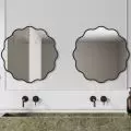
The bathroom in the private area is actually a bath room - created in the place of the former kitchen, which managed to accommodate a large semi-open shower, a wall-mounted bathtub and two sinks
© luumo
The bathroom in the private area is actually a bath room - created in the place of the former kitchen, in which we managed to fit a large semi-open shower, a wall-mounted bathtub and two sinks. The custom-made stylized cabinet under the sink "without angles" was meant to relate to the curves in the living area. In order to make connections in the bathrooms that would allow to realize the established arrangement, modifications also had to be made on the side of the neighboring apartments.


