The bright interior of the Poznan apartment by {tag:pracownie} is interspersed with blue motifs inspired by Maria Komorowska's tapestry, and the decorative elements in the shape of animals collected by the residents add a humorous touch.
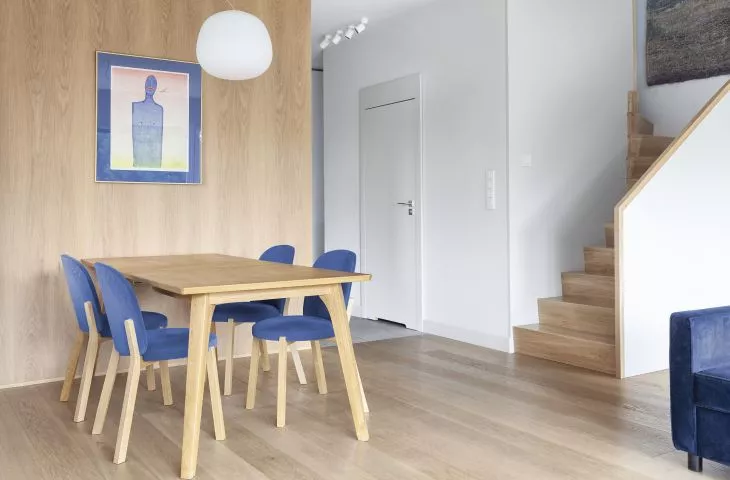
The main material used in this two-hundred-square-meter apartment is light wood - in addition to the oak flooring, the architects created a built-in - a multifunctional wooden cubby that runs from the dining room through the hallway to the separate vestibule. It also serves as a capacious wardrobe closet, an open cabinet for handy items, as well as a seat and shoe storage.
In the living room there is a table in the shape of a dog
© Ktura Architekci
According to Katarzyna Buczkowska-Grobecka:
Both the residents and we felt like introducing color here. We strongly considered navy blue and blue from the beginning, but it was the tapestry titled "The Sea" by Maria Komorowska-Grobecka. "Sea" by Maria Komorowska helped in the final choice. In addition to the distinctive sofa and chairs, shades of blue appear on the carpet and the painting in the dining room. Pale blue was also smuggled in on the tiles in the kitchen. Both bathrooms and the kitchen remained in a calming white and gray style.
The tapestry became the inspiration for the introduction of blue and gray color accents
© Ktura Architekci
Theaccent is provided by decorative furnishings collected by the residents, such as a cast dog in the living room that serves as a table, a golden dwarf stool in the kitchen and a ceramic hippopotamus in the bathroom.
A multifunctional wooden cubby
© Ktura Architects
Thestaircase consumed the most design and construction work. The architects wanted to hide them as much as possible, despite their placement in the living room. They achieved this effect by designing a full, light-colored balustrade, which additionally hides the door to the storage room for household items near the floor. The accent detail for the communication to the apartment floor is a wooden, rounded handle.


