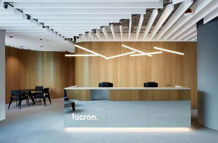
Theoffice of Slovak company LUCRON Development, located in the Steinerka Business Center in Bratislava, opened some time ago, but now, in times of pandemic, the ascetic interior design takes on added value - the simpler and roomier, the safer for employees.
The interior of the office was created by designers from Čechvala Architects. It was important for LUCRON that the arrangement created a space with a character that employees can identify with. There is no excess of colors and accessories. The spaces are not overwhelming, instead there are plenty of calm tones - white, black, gray and natural wood. The architects focused not only on the choice of materials, but also on modern technical details, which they cleverly concealed in the interiors. They created a mix of materials that complement each other, creating a backdrop for everyday life.
Calm color tones and natural wood dominate the interiors
© Čechvala Architects
minimalist interiors
Despite being one of the largest residential developers in Slovakia, LUCRON has opted for a modest design in its headquarters. The new layout of the 1,500-square-meter office is divided into two parts. The northern part consists of offices shaped in the traditional manner, except for an inner core that includes all service areas. In contrast, the southern part is a flexible office - dominated by large desks suitable for consultations and meetings. Another distinguishing feature of the layout of offices for managers called "cottages," forming permanent islands in the office, where each "cottage" represents a different department of the organization. High-quality acoustics and independent lighting systems create a friendly working environment.
In the reception area, visitors are greeted by a large mirror
© Čechvala Architects
According to Maciej Sobolewski - sales manager of Poland Knauf Ceiling Solutions:
Today, from the perspective of time and the new era that COVID-19 has imposed in offices, this timeless minimalism seems salutary. A lot has changed in office design in a few months. The enrichment of public interiors with design elements such as pillows, rugs and decorative trinkets, which has been fashionable in recent years, will no longer be so popular. Spaces where people stay need to be simple, easy to keep clean.
acoustic ceilings - design overhead
White acoustic ceiling absorbs sound and reflects light
© Čechvala Architects
Both zones of the office are distinguished by warm wooden cladding and good acoustics. The designers treated the ceilings not only as an element that contributes to shaping an ear-friendly and well-being space, but also as a decorative element. The ceilings stand out in open, subdued spaces with rows of vertical Optima Baffles acoustic panels. The white panels provide the highest level of sound absorption, while helping to illuminate the interior by reflecting light. Importantly, the Knauf Armstrong ceiling tiles used are eco-friendly in their composition, with as much as 77% of the materials coming from recycled sources.


