Arrangingsmall interiors is quite a gymnastics! How to functionally and at the same time interestingly design the spaces of apartments with an area of less than thirty square meters? Architects from the studio Mili Młodzi Ludzie took on such a challenge, designing the interiors of two apartments for short-term rent in the Poznan district of Jeżyce.
The task involved two studios with balconies - a smaller one of 23 m² (with a view of the Poznan zoo) and a slightly larger one of 27 m².
one-room apartment of 23 m²
floor plan of the apartment
© Mili Młodzi Ludzie
The smaller of the apartments is, according to the project's authors, a typical small apartment design - into the bright rectangular-plan interior, the architects introduced a box that serves multiple functions - housing a kitchen, storage spaces, a bedroom and a sitting area.
The 


box performs multiple functions - houses kitchen, storage spaces, bedroom and seat
photo: PION Studio
The kitchen area of the box is separated by an openwork wall, with capacious cabinets and drawers in the lower part of the wooden structure and an open seating area in astrong red color, and on top - a bed surrounded by low walls in a dark green shade, which appears in a few more places - in the mini kitchen and on one of the shelves. The zoo neighborhood is to be reminded by a monkey-shaped lamp hanging above the round table.
left: the kitchen; right: a fragment of a red seat and a green shelf
photo: PION Studio
studio apartment 27m²
apartment floor plan
© Mili Młodzi Ludzie
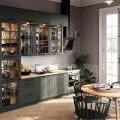
The slightly larger apartment on an inverted L-shaped plan consists of two rooms - a living room with a kitchen and a bedroom deep inside. The architects in this project focused on the play of strong colors - navy blue on the front door and in the kitchen and burgundy in the bedroom - juxtaposed with light colors on the walls and floors.
Left: navy blue kitchen; right: bedroom
photo: PION Studio
Graphically dividing the kitchen in navy blue, or delineating the sleeping area in maroon in the bedroom, are complemented by metallic brass accents in the form of lamps and handles, the architects from the Mili Młodzi Ludzie studio add.
The bachelor apartment is full of functional, yet aesthetic solutions - the interior is optically enlarged by a wall of mirrors in the kitchen, behind which the designers hid a refrigerator, and both in the bedroom and kitchen there were high-hanging cabinets that provide storage space and free up space. In the central part of the apartment stood the bathroom, which is separated from the living room by a wall of white corrugated sheet metal.
Left: the interior is optically enlarged by a wall of mirrors in the kitchen; right: in the central part of the apartment stood the bathroom, which is separated from the living room by a wall of white corrugated sheet metal.
Photo: PION Studio
Despite the very small spaces, the architects managed to fit the basic elements in both apartments - places to sleep, to relax, to eat, to prepare meals and to store things. And all this with attention to quality, functionality and aesthetics.


