Adapted Attic is a project and private apartment of architects from be3 pracownia projektowa, located in an almost century-old building in the center of Bytom. We talk to Agnieszka Wyrwas about the work, inspirations and the differences between designing for yourself and those on commission.
The attic adapted by the architects is located in an almost 100-year-old tenement house in the very center of Bytom. The tenement was built in 1922, according to a design by Silesian master builder Felix Wieczorek. According to the original design, the attic was used as living quarters for servants and a laundry with a drying room.
The architects introduced a strong yellow color into the circulation area
© be3 design studio
The space consisted of two zones - the attic, which used to serve as living quarters, and the attic area, which occupies half of the entire attic area of the townhouse. At the time when the design work began, the entire space was a non-utilitarian common area, which required permits and conversion into a residential unit. All buildings and furnishings of the apartment, were designed by the architects already at the stage of planning the function. The designers were keen to maximize the potential of the slants and space.
White is the dominant color in the apartment
© be3 design studio
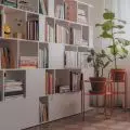
The ubiquitous white in the form of white walls and white polyurethane resin flooring is a treatment designed to highlight the restored structural elements. White has also become the perfect background here for strong accents, minimalist plywood built-ins and yellow color, which communicative zone becomes a link between different rooms. In the living area, the most important thing is the staircase, which, in addition to its communicative function, also serves as a shelving unit and a supervising station for the cats. The shelving was made of waterproof lacquered birch plywood.
The architects of be3 design studio received the main prize in the Young Creator category in the Architecture of the Year of the Silesian Voivodeship 2020 competition . The jury appreciated their intriguing in perception, attractive and fresh in implementation effect discourse of tradition and modernity, the imagination of the architect and the needs of the investor.
staircase hides a bookcase
© be3 design studio
Dobrawa Bies: Is designing for yourself significantly different from designing for a commission?
Agnieszka Wyrwas: On the one hand, it's sheer pleasure - designing for yourself, you can incorporate the boldest ideas, experiment with different solutions and materials, without trying to convince the investor and look for compromises. The only limitations are time and budget - which, of course, is also very important for the final implementation.
On the other hand, the lack of restrictions and the enormity of ideas can be deceptive. Concepts have changed a lot throughout the design and implementation stage. Even today there are new plans that we would still like to put into practice. The only constant and unchangeable element of the designed space is the function and layout of the rooms, which we discussed for a long time and finally managed to achieve an almost ideal layout. When designing for yourself, one has the urge to create an interior as a showroom to encourage potential investors in terms of style and solutions.
By designing for yourself, you can bring your boldest ideas to life
© be3 design studio
Dobrawa: What were the assumptions and design inspirations? Did you manage to achieve all of them?
Agnieszka: We wanted to create as open a space as possible, with dominant white on the walls and floors, so as to expose the existing roof structure and plywood buildings. The white here also became the perfect backdrop for strong accents in the form of monolithic, minimalist plywood built-ins and color, which spills into the circulation area, becoming a link between the various rooms. An interior designed in this way also offers a huge number of possibilities, so that in the future, with small interventions, we can change its character without extensive interference.
To date, we have not yet managed to achieve all the assumptions. Several smaller and larger finishing ideas are still waiting to be implemented.... and new ideas are still emerging :)
The apartment is full of light and space
© be3 design studio
Dobrawa: How do you make the most of the attic space?
Agnieszka: Despite appearances, the attic is a very graceful space for interior design. Bevels are an ideal place for various types of storage and built-ins. The adapted attic is one of the high ones, this gave us the opportunity to separate the mezzanine, which created additional space without significantly increasing the usable area.
has a mezzanine, the architects placed a sleeping area with a bed built under the roof slants
© be3 design studio
On the mezzanine we placed a sleeping zone with a bed built under the slants and with a skylight - our window for the night starry sky. The bathroom also turned out to be an ideal place under the slant. We placed an open shower in an alcove under the slants, which fit perfectly into the space.
Dobrawa: Thank you for the interview!


