This apartment was designed by architect Katarzyna Buczkowska-Grobeckafor herself and her family. It is exactly as she wanted it to be, and the main inspiration for the interior was the stained glass window in the bathroom. Such design gems can be found in old Poznan tenements in the Wilda district.
Katarzyna Buczkowska-Grobecka of Ktura Architekci studio once again took on the challenge of designing a space for herself and her loved ones. In addition to modern design and unobvious color combinations, there were also classic furniture and accessories referring to the character of the tenement.
Basia Hyjek: What was the main inspiration for this project?
Katarzyna Buczkowska-Grobecka: Definitely the window with the stained glass window.... That's where it all started... We knew that color was going to be a permanent feature of this space and we had a great desire for it. We wanted to take a bold approach to forms, textures and colors, breaking away from the ubiquitous and I guess you could already say "Polish" trio: white, gray and wood. This is a house where we decided to go for contrasts, stimuli and experiments. In it we juxtapose the new with the old. We combine soft and hard forms, and even warm and cold. We test and strongly interact with the interior. That was the idea for this house.
A window with stained glass... This is where it all started....
PHOTOGRAPHY
Basia: You designed for yourself and your family. What were your needs?
Catherine: To make it, first of all, a house for living and intensive use. It had to be comfortable and functional. It was to be my next experiment...because this is my living space. I am an architect and I design residential architecture, and single-family is my greatest passion! This is the second interior I designed for myself and my loved ones...I love it and every day I feel like being here and coming back to it. The problem, however, is that more plans and spaces are already being born in my head! I don't think it will ever end....
Basia: How was the space divided up? What did it look like before?
Catherine: The space was divided optimally. We gave up a separate kitchen, designing a kitchenette in the living room and an additional small multipurpose room. We streamlined the hallway to lead to three independent rooms. The last one was enlarged and more strongly illuminated by daylight. The previous layout was in some part an amphilade, which is not bad, but did not give us the possibility to easily and quickly divide it in the future.
The previous layout was in some part an amphilade, which is not bad, but did not give us the opportunity to easily and quickly divide in the future
© Ktura Architects
Basia: Where did you get such an idea for the combination of colors, patterns and styles?
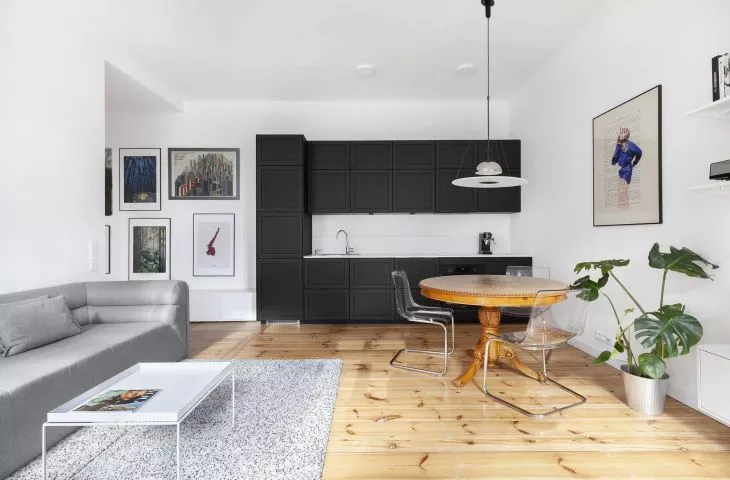
Catherine: We had a great desire for it... We wanted to introduce color and bold moments. Feeling architecture by touch is very important to me, both when designing small and large architecture. Hence such clear connections and juxtapositions often very close to each other. We present graphics in different ways, sometimes behind glass, sometimes on matte paper, or simply choose forms that are completely different, like fibers and fabrics, i.e. my Grandmother's beautiful tapestries. Another such place is a cozy, stylized table on a beautiful carved leg, acquired at an antique exchange, around which we put transparent plexiglass and cold chrome. It's our favorite detail of the house.
A cozy, stylized table on a beautiful carved leg, acquired at an antique exchange, around which we put transparent plexiglass and cold chrome. This is our favorite detail of this house
PHOTOGRAPHY
Basia: What gave you the most pleasure during the design process, and what was the biggest challenge?
Catherine: Designing the functional layout was definitely the greatest pleasure, because I knew exactly what we really needed. The large number of windows offered a lot of possibilities, and in the end we refined the space down to the centimeter. Key here were the storage areas.... There is a lot of it, however, we don't see it at first glance. The biggest challenge for us was undoubtedly the choice of lamps. Both their forms and the colors of the light itself. Looking at them today... I think we managed it.


