Warsaw's Powiśle district is characterized by a combination of new urban fabric and old architecture. Such an example is a century-old tenement house with three contemporary floors added, which houses a two-story apartment designed by {tag:pracownie}. The color scheme, interplaying textures, interesting details and art make us enter the artistic world of the apartment's owner upon stepping over the threshold.
The two-level apartment is located in the contemporary part of the building. It has an area of 77 square meters and occupies two floors with an analogous area and layout. An unquestionable advantage of the apartment is the two terraces, which overlook the urban gardens located on the roof of the nearby University Library.
The living room features art by Dorota Buczkowska, Malwina Konopacka and Piotr Lorek
Photo: Marcin Grabowiecki © Modeko.Studio
Interior tailored to interests
The interior was designed for a young investor who is taking her first steps in the fashion industry. Although the apartment was de facto furnished, the owner was very keen on transforming an impersonal, gray apartment finished to developer standard into an interior that matched her interests. The designer loves to combine fabrics of different patterns and textures, which became a great starting point for the architects. They decided to use different types of fabrics, varied colors (pinks, mint, warm beiges, soft blues) stylish, artistic accessories and numerous plants. Original stone and terrazzo were also introduced into the interior.
In the entrance area, an interesting element is an openwork wall
Photo: Marcin Grabowiecki © Modeko.Studio
artistic space
The interior was well thought out in terms of functionality, so there was no need to make major changes. The architect felt that the developer's concept made good use of a difficult to design space lacking right angles. The designer decided not to replace the three-layer plank flooring, but only to scrape it and change the color from a cool shade to a warmer, natural oak.
We very much dislike destroying what will fit into the new concept after slight changes. The idea of sustainability is close to my heart, I don't like to waste finishing materials and buy new ones at any cost, but completely unnecessarily," says Pawel Leczycki.
An accent in the kitchen is colorful terrazzo and a lamp designed by Poul Henningsen
Photo: Marcin Grabowiecki © Modeko.Studio
entrance area and kitchen
The upper level is occupied by a conveniently designed entrance zone. Here an interesting solution draws attention - an openwork wall made of MDF and varnished in gold, combined with a glass part of the balustrade framed in black aluminum. It separates the entrance area from the staircase leading to the private part of the apartment. The motif of black lines and frames can also be seen in the interior in the form of black baseboards, window frames and decorative elements in the living room and bedroom.
The oak development of the hall goes into a row of kitchen cabinets
Photo: Marcin Grabowiecki © Modeko.Studio
On the left, the oak development of the hall passes into a sequence of kitchen cabinets - the refrigerator development and the kitchen closet. The kitchen is not large, but it is arranged functionally enough that the room also has room for a round table for four. In the developer's version, black, white and shades of gray dominated here. Modeko.Studio, following the principle of not wasting what is good, kept the white fronts of the kitchen cabinets, combining them with new, natural oak veneered posts. In the posts found their place household appliances. The middle part of the kitchen development gained a white conglomerate countertop with a recessed sink. In order not to visually break up its smooth surface, a white electric hob was installed in it. Colorful terrazzo protecting the wall between the countertop and the wall cabinets and the famous lamp, an icon of Scandinavian design - PH 5 designed by Poul Henningsen- add accent.
Repetitive circle motifs - mirror in the hallway and carpet in the living room
Photo: Marcin Grabowiecki © Modeko.Studio
living room filled with art
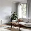
The living area of the apartment - the living room with a sofa, coffee table and armchair - is a relaxing area, the interior of which is flooded with natural light. The shape of the living room is imposed by the dynamic slanted glass wall, and its color scheme by the turquoise cladding on the building's facade. Art plays a very important role here - on the walls hang paintings by Dorota Buczkowska, on the cabinets and windowsills stand ceramics by Malwina Konopacka and a sculpture by Piotr Lorek.
RM58 armchair, ceramics by Malwina Konopacka and sculpture by Piotr Lorek
Photo: Marcin Grabowiecki © Modeko.Studio
The turquoise of the facade blends with the extinguished green of the spreading corner and the steel cabinet. Elegance is added by gold accessories - trays, pillows and, above all, standing lamps placed on two sides of the sofa. A circular rug highlighting the lounge area - sofa, pouffe and coffee table repeats the circle motif, which appears in the staircase as a giant mirror cut in half. It is worth noting the classic of Polish design - RM58 armchair designed by Roman Modzelewski.
The bedroom is dominated by shades of pink
Photo: Marcin Grabowiecki © Modeko.Studio
bedroom in pink colors
A staircase leads down to the private part of the apartment, where a bedroom with a space for work, a bathroom, a dressing room and a laundry room with a utility room have been located. The bedroom is dominated by a pink wall and cornflower carpet. An upholstered velour panel was placed at the headboard of the bed, whose vertical stitching reaching the ceiling visually elevates the room. On one side of the bed a black pendant lamp was installed and a classic bedside table was placed. On the other side - the cabinet is replaced by a metal auxiliary table illuminated by a gold wall lamp. In the bedroom, as in the whole apartment, textiles were chosen with great care. All in mild colors from a palette of pinks and blues, they differ in texture and type of fabric.
The work area and turquoise facade visible from the bedroom windows
Photo: Marcin Grabowiecki © Modeko.Studio
Thework zone is the opposite corner of the room. Here there is a simple custom-made desk and a swivel leather chair. The space is separated by a pattern on the wall in the form of slanted breaks. White and pink shapes on the wall repeat the slant of the room's glass wall.
Terrazzo bathroom
The bathroom was designed using distinctive patterns and contrasting colors. The base of its finish is colored terrazzo, with which the wall opposite the door is lined, passing into the wall of the shower room. The suspended toilet system was built with an MDF board in a dark shade of turquoise, and this color was also used on the ceiling.
The bathroom is dominated by terrazzo and turquoise
Photo: Marcin Grabowiecki © Modeko.Studio
The upper part of the development is occupied by capacious cabinets for cosmetics, towels and cleaning products. Noteworthy is the veneered under-basin cabinet custom-made according to Modeko.Studio's design. On the conglomerate countertop stood an oval washbasin, the fixtures of brushed brass blend with the round mirror in a gold frame. The main source of light is a plafond that gives a pleasant, diffused glow.


