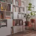
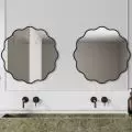
Photos of the interior of a Wroclaw apartment arranged according to the design of Filip and Amelia Symonowicz of Kohlrabi studio introduce a slightly nostalgic, autumn mood. However, this is not a gloomy space - dim colors, their various cool shades of green, gray, black and slightly "cloudy" white create a subdued, yet elegant whole.
Left: rounded corner in the kitchen; right: round dining room table
Photo: Stanislaw Zajączkowski
The small apartment of less than fifty meters in the center of the capital of Lower Silesia is arranged on a rectangular plan. A bedroom with a workspace was planned opposite the entrance, and a bathroom on the right. The other part of the interior is formed by an open space living room with a kitchen and a small dining room. The whole is full of clever solutions that optically enlarge the small space.
floor plan of the apartment
© Kohlrabi
The apartment underwent minor adjustments in the layout of the walls, which improved its functionality. Space was freed up for a closet in the hallway and a place for a desk in the bedroom," explain designers from Kohlrabi, a Wroclaw-based studio.
An interesting solution is the combination of the kitchen and the living room - although they are located in one space, the zones are visually separated by a differentiated floor. On their border, the designers placed a low wall and furniture adjacent to each other with their backs - a cabinet with built-in dishwasher and sink on the kitchen side and a soft sofa in dark green on the living room side.


view from the kitchen to the living room
photo: Stanislaw Zajączkowski
The space has been combined with finishing materials and colors so that it blends seamlessly, the authors of the project emphasize. - The walls were dressed in delicate, natural colors, enriched with textures and spindles that give additional play of chiaroscuro. With curtains and lighting, we created zones with a theatrical character, and with large mirrors we enlarged and introduced more light, they add.
The 


The living room space is optically enlarged by high mirrors
photo: Stanislaw Zajączkowski
Optically enlarging the space, high mir rors and softly arranged curtains are placed on opposite walls of the living room. Between them, the architects placed the kitchen cabinet, in which the upper shelves are white (thanks to which they optically seem lighter) and the lower shelves are wooden, a round, dark dining table with a lamp of an intriguing color hanging above it, and the already mentioned sofa. The sofa faces a two-tone wall, on which a TV and a narrow cabinet have been placed. This wall is decorated with high wainscoting and it is up to its height that some of the walls in the living area are painted.


view from the living room to the hallway
Photo: Stanislaw Zajączkowski
The hallway and bathroom are distinguished by a contrasting combination of black and white on terrazzo-patterned surfaces, while the bedroom is kept in light, neutral colors - the textures of the gray headrest and the light-colored cabinet on the wall behind the bed and the colorful illustrations decorating the wall above the desk come to the fore.
left: a fragment of the bedroom; right: a detail of the bathroom
photo: Stanislaw Zajączkowski


