How to functionally design
a place to live and to work?
The last two years have emphatically shown that it is worthwhile, if possible, to set aside at least a small part of the apartment for a home office. The idea of combining a place of work with a place of residence guided the architects of the Atelier Starzak Stebicki studio when arranging the interior of an apartment on the third floor of a building located in the very center of Poznań.
The apartment of nearly 150 square meters was created by combining two apartments. However, it was necessary to make changes in the existing layout so as to create comfortable and functional spaces - living and office, which, although connected, will be clearly separated from each other. Importantly, the retained separate entrances to the two apartments allowed for separate access to the office area.


apartment plan before and after renovation
© Atelier Starzak Stebicki
An important assumption during the design process was to separate the functions of living and working so as to guarantee the independence of each zone, explain architects from Atelier Starzak Strebicki. - Thanks to a system of sliding doors made to the full height of the rooms, the possibility of hierarchizing the level of accessibility of the space and visually combining or separating individual rooms as needed was obtained.


axonometra
© Atelier Starzak Stebicki
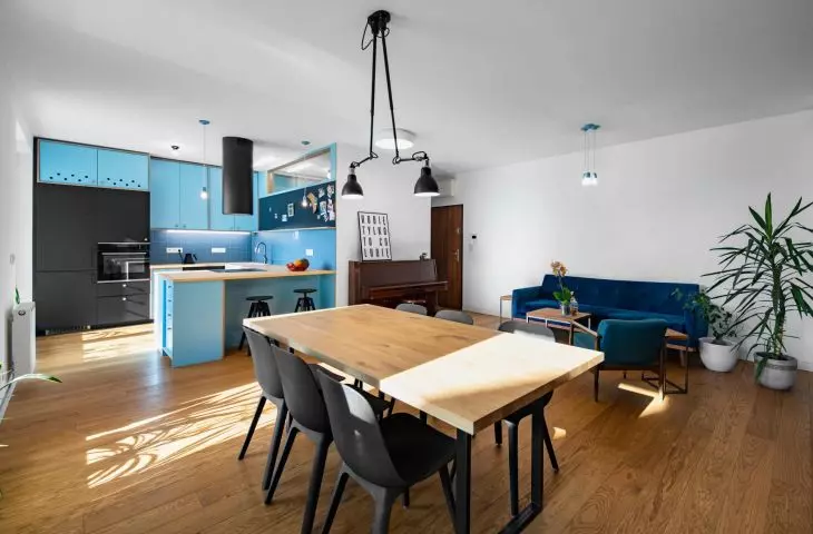
Lighting the apartment from two sides - from the north and from the south - allowed us to plan the living area on the quieter side of the courtyard, and the work area - the study and photography studio - on the street side. The heart of the apartment is an open living room with a kitchenette, which was designed as a designer combination of off-the-shelf elements and parts created on request by a carpenter. The kitchen is dominated by black and shades of blue. These colors, against a background of white walls and wooden floors, appear in other parts of the apartment and constitute the leitmotiv of the entire interior. Theexception is the minimalist photography studio, which is painted black from the ceiling to the floor.
The 


A kitchenette is a combination of off-the-shelf elements with parts created to order by a carpenter
photo: Jakub Wittchen
The interior finish is largely characterized by the use of various shades of blue - the investors' favorite color, the authors explain. - The designed interior was made of laminated birch plywood covered with HPL on both sides in a shade of blue, and MDF lacquered in navy blue. The flooring was finished with brushed oak wood, and in the bathroom, stained ceramic tiles were used, the Poznan architects add.
Left: view of bedroom with free-standing bathtub; right: interior detail
Photo: Jakub Wittchen
Right next to the entrance is located the bathroom, which is illuminated through a narrow glass window in the kitchenette. Further into the living area, the architects planned a guest room, which they explain is a buffer zone between the living area and the more intimate spaces of the bedroom with a free-standing bathtub, a separate bathroom and a sizable dressing room.


The bathroom and technical room in the photo studio
photo: Jakub Wittchen
Architects from Poznan's Atelier Starzak Stebicki often use customized functional buildings in their projects, which tie the whole arrangement together. They used a similar solution, among others, in the design of Atelier Urbanist's headquarters, where the dominant colors were yellow and green, and in the design of a 1950s apartment conversion, where a multifunctional "wall-furniture" separated individual zones.
