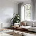
In Cracow, a duo of architects from the Furora studio - Diana Żurek and Bartosz Girek - created an interior design for a rental apartment. Fullness, as the authors called the project, is an intriguing space combining original elements from the 1940s with contemporary materials and furniture. What is the result of this fusion?


kitchen with dining room, in depth - bedroom
photo: Studio Resources
The minimalist, somewhat austere interior of the apartment is in keeping with the style of young architects.
We try to create spaces that are comfortable, but not obvious - with a wink. Based on a combination of classic solutions with modern restraint and a touch of playfulness, we create sophisticated mirages. We look for healthy uniqueness and focus on expressive, bold ideas, giving the interiors a personal touch and a timeless dimension," Diana Żurek and Bartosz Girek write about themselves.
The 


architects preserved the original beamed ceiling in the apartment
Photo: Studio Resources
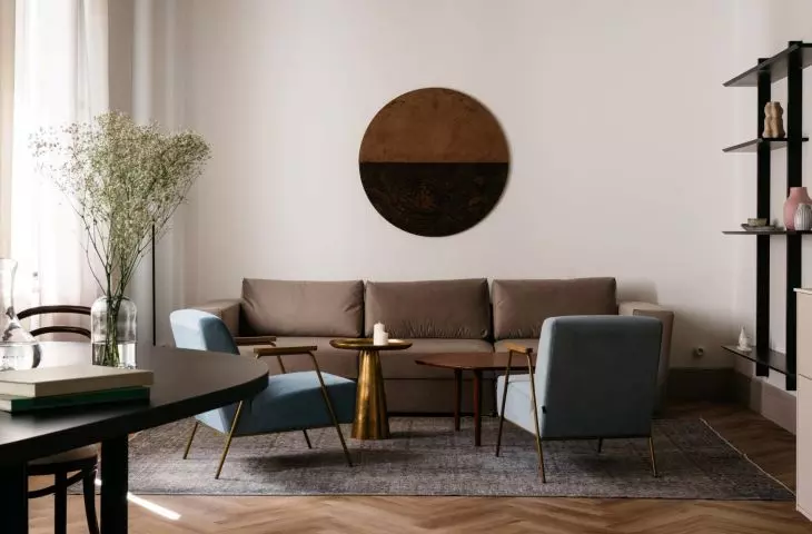
On an area of nearly 70 square meters, using a narrow range of colors and a small amount of furniture and decorations, they created a space where different zones intermingle, elements reflect, and patterns and textures intertwine, while creating a coherent, harmonious whole.
The minimalist living room of the Fullness apartment
Photo: Studio Resources
About the design of Krakow's Pełnia apartment
is told by the architect from the Furora studio - Diana Żurek.
Ola Kloc: What was the priority for the investors?
Diana Zurek: The investors wanted to create a space for rent, either short-term or long-term, depending on how the market develops. So we left with the assumption that we had to give the place the most interesting form possible, so that it would attract those who want to enjoy the eye with something interesting for a while, but also be fully comfortable and functional during a longer stay.
Left: view from the living area to the bedroom; right: detail of the mirrored doors
photo: Studio Resources
Ola: What measures did the apartment require? Were changes in the functional layout necessary? If so, what kind?
Diana: We tried to reflect the original layout as much as possible, so we only made minor changes, subtle shifts of openings and extensions of walls, which allowed us to make a more thoughtful arrangement.
Ola: What influenced this choice of materials, colors and textures?
Diana: We strongly suggested the authentic exterior form of the building, which dates back to the 1940s. The exterior form is dressed in subdued colors, gray terrazzo floors, simple form, and decorative gate and balcony hardware. We wanted to maintain this raw character by bringing it into the interior. We also took advantage of the original fabric in the form of the beamed ceiling, which was restored, and put a strong accent in the form of mirrored doors - topped off with muted blues and pinks.
Left: mirrored bedroom door; right: mirrored door reflection
photo: Studio Resources
Ola: Fullness - where did you get the idea for such a project name?
Diana: First of all, because all elements intermingle, reflect in each other (through the use of mirrors), overlap, create sometimes unobvious reflections and together fill the space.
Ola: What was the most difficult part of this project, and what are you most satisfied with?
Diana: The most difficult element was undoubtedly the creation of the effect of spaciousness and comfortable development of every part of the apartment. Despite its rather large size, its layout is strongly elongated, which often determines many solutions. We tried to give it zoning with furniture of various shapes, without solid partitions and divisions, while creating a living and night zone, where the night zone is hidden behind a door with a mirror, making the living side a decorative portal to the private space.
Left: a section of the bedroom; right: interior details
photo: Studio Resources
Ola: Thank you for the interview.
