Rem Koolhaas - starchitect, winner of the most important awards in the world of architecture - the Pritzker Prize (2000) and the Mies van der Rohe Prize (2005) will celebrate his 75th birthday this Sunday, November 17. To mark the occasion, in today's "Coffee Break" we remind you of seven, in our opinion, most interesting projects by the OMA and AMO studios.
De Rotterdam
The multifunctional De Rotterdam complex in the port district of Wilhelminapier is designed as a vertical city. Three interconnected buildings house: offices, apartments, a hotel, conference spaces, stores, restaurants and cafes.
De Rotterdam, Netherlands, Rotterdam, 1997-2013
© Nicanor García
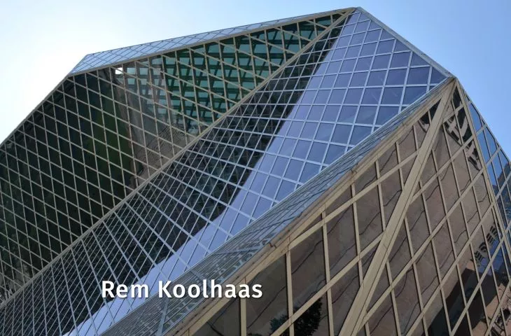
Seattle Library
The modern library edifice resembles a faceted gemstone. Did you know that Bjarke Ingels also worked on the design of the zigzag block?
Main Library, USA, Seattle, 1999-2004
© Peter Molick
Casa da Música
The concert hall is another diamond in Koolhaas' collection. The lump of white concrete with beveled edges uses the city as a backdrop for performances by the National Orchestra of Porto.
Casa da Música concert hall, Portugal, Porto, 1999-2005
© Bart de Visser
Prada Epicenter
Koolhaas has worked with the Prada brand for many years, not only on exclusive boutique projects, but also on fashion show sets.
Interior of the Prada store, USA, New York, 2000-2001
© Pooya AleDavood
The Image of Europe
AMO, a research and design studio under the supervision of a Dutch architect, has developed a new flag for the European Union, a barcode that combines the colors of the member states' flags into a single symbol.
The Image of Europe, Belgium, Brussels, 2001
© OMA
CCTV
The headquarters of Chinese television is sometimes maliciously referred to as "big pants." However, the designers' goal was to create an alternative to the familiar forms of typical skyscrapers.
Headquarters of China Central Television (CCTV), China, Beijing, 2002-2012
© Iwan Baan
Elements of Architecture
The motto of the 14th Venice Biennale, curated by Rem Koolhaas, was a return to the fundamentals of architecture - "Fundamentals." One of the exhibitions was titled "Elements of Architecture" and was a three-dimensional illustration of the publication - the fruit of two years of research by the architect with students from the Harvard University Graduate School of Design on the individual elements of buildings.
Venice Biennale 2014, Italy, Venice, 2013-2014
© OMA
And which project is your favorite? Be sure to let us know in the comments.


