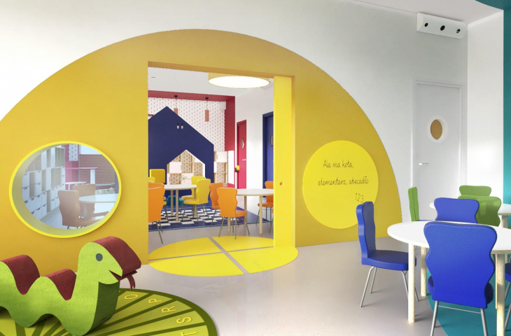
Designing an interior for children of different ages is always a big challenge. The interior of the nursery and kindergarten in Dąbrowa Górnicza designed by IN Design Studio is a coherent space, simple geometric forms and uniform bright colors create a playful mood. The designers managed to avoid infantilism by treating children as equal users of the space and bending to their needs.
The project was commissioned by a kindergarten and nursery in Dabrowa Gornicza. It includes three colorful floors for play and learning, as well as a checkroom area - a total of as much as 500 m² of space. The combination of different functionalities and the specific needs of the users of this space, children aged one to three years, made it a major challenge for the designers.
best practices
The main idea, which guided the investor who ordered the project, was to create an unconventional space for the youngest children, where there will be zones for play, rest, dining and a place for performances. According to Diana Żurek, an architect from the IN design studio:
We were looking for simple but surprising forms by cataloging and taking inspiration from the perfectly designed kindergartens of Denmark or the Netherlands, which we met while working abroad a few years earlier.
color zones
A key task during the design process was to define a consistent color palette, adapted to ages 1-3, so that the spaces would motivate creativity without disturbing children's perception or being too intrusive. The designers solved this problem by proposing a gray, neutral background sprinkled with abstract, shaped spots. They delineate zones with specific functionalities: rest in blues and greens, physical activity in warm yellows, or eating in appetite-stimulating reds. In addition, the colors are present on the floors and walls in the form of games, a place to paint, and study. In each zone there are elements suggesting various forms, houses, skies, a clearing or the sea.
The play zone in a nursery and kindergarten in Dabrowa Gornicza
© IN Design Studio
small users, big challenges
Among the biggest challenges, the designers included designing the space in such a way that each floor was a bit surprising, but at the same time related in character to the next floor. This effect was achieved through the aforementioned color palette, but also by adding an element to each room that distinguishes it, such as a playground, mini-theater or "under the clouds" areas. Diana Zurek also talks about what it's like to design for small users:
Another test for us was to understand that this time our horizon is at a height of less than 90 cm, and the table is not the normative "75", but four types of different forms, with different heights adapted to the age of the wards. We also wanted the nursery space not to be too infantile and literal, but rather, through architectural means, to stimulate its users to play constructively and full of experiments.


