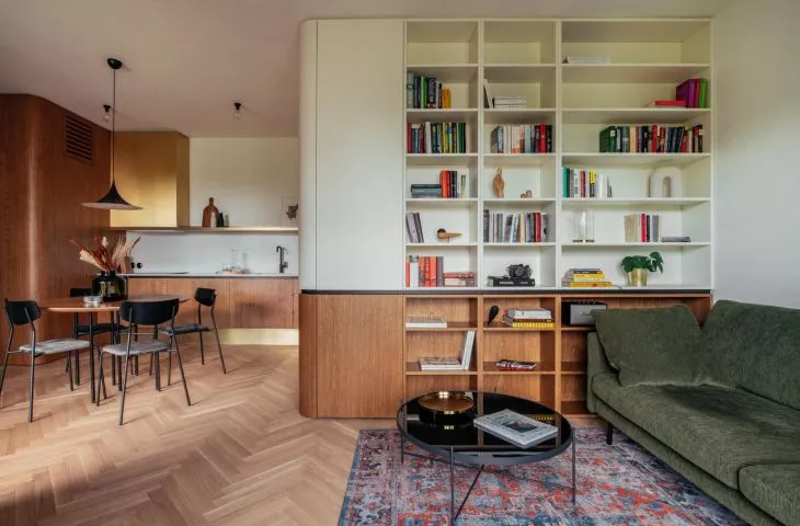
The interior of the apartment by the Oliwski Park in Gdansk designed by rum studio is elegant, design-oriented, and at the same time extremely cozy and homely. The designers, arranging the space (from the developer's state by moving walls, searching for the right proportions and functional solutions), created a coherent and user-friendly apartment.
The interior was divided into an open living area with a kitchen, living room and access to the terrace, and a night area - with a bedroom and bathroom. The spacious living area is unified by a gently curved wooden form, which is led from the hallway, where it creates a capacious closet, through the lower part of the development in the kitchen to a high bookcase in the living room.
apartment plan
© rum studio
With the wooden floor, which was a dream of the investors, and the wooden paneling, the designers juxtaposed furnishings that add character, including a brass hood housing, white kitchen cabinets, a green corduroy sofa, a leather armchair, a colorful rug or a stylish newspaper holder from the 1970s.
The bedroom, on the other hand, is dominated by the intriguing shade of extinguished green used on the walls, juxtaposed with a blue velour bed headrest, while the bathroom is dominated by universal grays.
The 


The living zone is scaled by a gently curved wooden form
photo: Hanna Połczyńska | kroniki studio
Ola Kloc: What was the priority for investors?
rum studio: Definitely a wooden floor. The decision to choose it was made even before the investor approached us and was non-negotiable, but we were very pleased.
Ola: You started the interior design from scratch, from the developer's state, what did your design process look like?
rum studio: We found the apartment in developer condition. After the inventory, we proceeded to analyze the investor's needs and the functional scheme. Conversations with the owner, selection of materials, inspiration and again meetings with the owner.
When we had the necessary information, we prepared a full presentation of the concept. The whole thing appealed to the owner right away, although he had objections to the walls we proposed to move. In the end, he allowed himself to be convinced, and after seeing the results, he had no doubt that he had made the right decision. It wasn't without a few minor comments, which of course we took into account. We always bend to the comments of investors, after all, it is they who will live in these spaces and it is they who are supposed to feel good in them. At every stage, from concept to completion, we present the investor with our proposed solutions and materials. Frequent meetings are the key to successful implementation.


leather armchair in the living room
Photo: Hanna Połczyńska | kroniki studio
Ola: Wooden cabinetry in the living room and kitchen resembles a lamppost splayed on the corners. Where did you get the idea for such a solution?
rum studio: Lampery is an underrated functional and aesthetic element. Unfortunately, it is still associated by most with unsightly painting on staircases or corridors, we see it as an interesting way of functional or aesthetic division.
The curved corners give the development a lightness. It creates a continuous ribbon that leads us through the functions - from the entrance area, through the kitchen to the bookcase in the living room. The very material division forming the lamella was intended to balance the amount of wood used and to stand firmly apart from the higher parts of the development.
left: a fragment of the kitchen; right: the living room
Photo: Hanna Połczyńska | studio chronicles
Ola: The living room and kitchen are kept in natural colors, while the bedroom impresses with a green textured wall, furniture in the same shade and a blue upholstered headrest. What influenced this choice of colors, textures and materials?
rum studio: Playing with colors and textures is something that helps create a user-friendly space. A complete repetition of the materials and color scheme from the living room would have been too simple and monotonous, with this treatment we wanted to differentiate it a bit from the rest of the apartment. The star of the living room is the green corduroy sofa, which serves as a kind of link between the rooms.
left: living room; right: bedroom
Photo: Hanna Połczyńska | studio chronicles
Ola: What was the most difficult part of this project, and what are you most satisfied with?
Rum studio: The existing layout of the apartment. Quite unusual because of the disturbed proportions between the size of the kitchen and the living room. We cared most about balancing these proportions to create a cohesive comfortable space.
Finding the right proportions was the biggest challenge, and this is also what we are most satisfied with - we managed to create a wonderful built-in that hides a huge amount of function and storage space, while dividing and not overwhelming the space.
Ola: Thank you for the interview!
