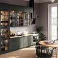
Soft colors, lack of major contrasts and a warm atmosphere - all this and more characterize the new interior designed by Jan Sikora. Elegance, which does not result from the use of typical, often banal solutions, flows from carefully selected accessories - furniture, artwork, lighting. The entire project is complemented by an original division of space.
Jan Sikora of {tag:pracownie} wanted to create an elegant interior, which at the same time is subdued. There is a lack of shining and considered elegant design elements. The architect managed to design a chic interior full of interesting solutions.
I felt the need for the apartment to be both elegant, but also versatile
© Sikora Wnętrza Architektura
Basia Hyjek: What was the main inspiration for the project?
Jan Sikora: An inner need for expression - I wanted to create a completely new style of interior, such a space that would be both timeless but also "fresh" in perception. I felt the need for the apartment to be both elegant, but also universal. I wanted to avoid in the interior the obvious cliché of "elegant is crystals on the ceiling," and preferred to play with form - for example, by paying tribute to the recently deceased Ingo Mauer with the Lucellino lamp.
This interior is also a fascination with world trends - there is furniture here that will appear in Polish design stores only in a few months. This, of course, would not be possible if it were not for art-loving investors open to such an "adventure". They are classy people and are filled with a great load of unforced wit. This is great potential for a designer to work with!
The colors are soft, as are the textures
© Sikora Wnętrza Architektura
Basia: Where did you get the idea for such a selection of colors and materials?
Jan: I was looking for a break from the usual patterns of what contemporary elegance is. I wanted to create a space that was unobtrusive, but on the other hand positively exclusive, calming and ideal for relaxation. We did some research in the studio and I saw that there is a lot of furniture and objects in the world today that respond to this idea. So the colors are soft, as are the textures. There's a bit of classic elegance - in center circles and French herringbone. There is also a lot of light, art and little contrast. It's a space meant to be an oasis in the hustle and bustle of the city.
Basia: Where did the idea for the division of the space come from?
Jan: The interior was formed by two connected apartments - this outlined the direction of the design work and naturally separated two functional zones: the upper private / master bedroom, the central kitchen with dining area and the lower / left lounge area. During the conceptual work I came up with an idea for two circles, in the central part of the apartment. In one I hid the riser and in the other the bathroom - this gave a very interesting style to this space.
The interior formed two connected apartments - this outlined the direction of the design work and naturally separated the two functional zones
© Sikora Wnętrza Architektura
Basia: What was the biggest challenge in creating this space, and what gave you the most satisfaction?
Jan: My own perfectionism. I have this principle - and I hope you can see it in this concept - that I don't let go of any detail. Of course, this attitude is a battle against time, the "devil of laziness" and the concentration regime. This has been the biggest challenge, but the satisfaction after completing the work is just as great. Also, the satisfaction of the investor gave me great joy.


