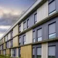
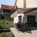
An apartment overlooking Krakow's Podgórze district, located on the top floor of a tenement building, is an interior full of harmony and coherence, despite the stylistically different levels. We talk to Dagmara Dela of DelaBartman studio about the long design work, inspirations, the importance of a well-designed space and its impact.
The Krakow apartment is located in a building that is a plomb, in a row of townhouses on Rękawka Street, naturally glued to the scarp. The escarpment is formed by "silica" rocks, on top of which there is a fort and a tiny St. Benedict's church built on the site of a previous temple dating back to around 1000. The investor's family has been connected with Podgórze for generations, so the choice of location was not accidental. Architect Dagmara Dela herself spent a good part of her life there, which she believes helped and influenced the design of this two-level apartment.
The first floor spaces are inspired by the northern Italian style
Photo: Jakub Dziedzic © DelaBartman
Dobrawa Bies: What were the assumptions and design inspirations?
Dagmara Dela: We started working on the project back in 2015, but after verifying the needs of the owners and the apartment they had at their disposal, we concluded that it was necessary to buy a second, twinned smaller apartment, giving a view of the rocks and the courtyard - so we did. This improved not only the square footage of the interior, but also the proportions, giving much more opportunity to create an attractive space. Our assumptions were to create an open, comfortable living space with a living room, kitchen, dining room, study and small bathroom on the first floor, and a purely private space on the first floor with children's rooms (initially one room and an open space for relaxation and exercise), a bedroom, dressing room and large bathroom.
The levels were also to differ stylistically - an elegant, refined, more atmospheric first floor, in the style of northern Italian apartments, finished with natural materials like stone wood and glass, in harmonious, muted tones. Beginning with the darkest kitchen, which transitions into the grays of the dining room and study to the brightest living room from which, in turn, we continue to the more cozy, fresh and luminous private spaces on the first floor.
The apartment consists of two levels with stylistic differences
© DelaBartmant
Dobrawa: What did the investors expect? Did the design cooperation go easily?
Dagmara Dela: With this type of investment, expectations are not clearly defined - usually very general assumptions like cozy, functional, elegant interior. At the same time, each investor has its own definition of these assemblies, our task is to recognize it, discover it and extract as much as possible from this information. The collaboration was very intense, with investors vacillating between the different directions the project could have gone. The final result is a balance between sometimes extreme needs. The most important thing is that in the end we managed to maintain harmony and consistency. Such cooperation often triggers innovative solutions and is very stimulating.
The windows offer a view of the nearby rocks
Photo: Jakub Dziedzic © DelaBartman
Dobrawa: The apartment is dominated by timeless materials, veneers, natural stone and modern design. Where did this design decision come from?
Dagmara Dela: The answer will not be original, I think that, the greatest value of natural materials is not their timelessness, because paradoxically we need change, but the desire, or even the need to interact with them. This is how we are constructed, the green of a tree will always soothe us, and artificial creations, although intriguing at some point tire us out. We can always introduce crazy elements into an interior that is harmonious and timeless, and they will work well in it. Tranquility will conquer the avant-garde character of the new thing, but at some point the time will come for it too. If someone likes this kind of energy, he will have to change to another one, because this one will simply get tired. And wood glass and stone, will always affect us in a similar way. However, in order for the interior not to be sexless, reflecting the character and interests of the residents, there are flavors at the design level, for example, in the study around the window, there is a glass bookcase, where the books are visible in accordance with the layout of the doorframe (that is, always facing the window). This is our original idea - on the countertop we see the books from above, on the ceiling from below, on the sides the spines are set facing each other.
bright children's bedroom
Photo: Jakub Dziedzic © DelaBartman
Upstairs, in the children's bedroom, we took advantage of the architectural slant, adding a second part of the canopy at the same angle, thus creating a cottage. There are more such flavors, they don't scream at first glance, we discover them while staying inside. This affects the viewer, even though he is not aware of all the solutions. It's like riding a train - we are moving, we are aware of it, but only part of us knows why it's happening. The interior works on us, we feel comfortable in it, not always knowing that someone analyzed it when designing it. It is not always enough to buy an expensive piece of furniture (which is also thought out), this furniture should be in an adequate space, then we will fully feel its qualities. Therefore, interiors are not a matter of taste, where something is liked by someone or not, if we already have to simplify this issue, then use the adjectives good and bad, designed or not.
atmospheric kitchen
Photo: Jakub Dziedzic © DelaBartman
Dobrawa: How do you wisely arrange the space of such a large apartment to maintain visual consistency?
Dagmara Dela: This is a very important question, large spaces require discipline on the macro level, where the micro is completely subordinated to it. When designing such an interior, we have to constantly go back to the perspective and check if something is out of place. In such a space, a detail takes on more dimensions, it can be an emerging coherent architectural element, or a small element against the background of a very disciplined space. It's similar to painting a picture, where you catch the extremes that have to play with each other, you have to make departures, you can check the proportions in a mirror or take a photo where the mistakes come out best. That's why one paints while standing, and the departures resemble a dance. Using the same metaphor, small interiors are like watercolors, we paint them sitting down, or even using a magnifying glass, where the role of "departure" is played by the distance between the hand and the head. In conclusion, perspective is always needed when designing, large interiors require more distance.
Dobrawa: Thank you for the interview.


