Where I like, which is where? In Gdańsk's Zaspa district! Architects Daria Bolewicka and Daria Skoczylas of the BO/SKO studio created a beauty salon interior rich in contrasting colors, geometric shapes and different moods.
Where I Like is a ninety-square-meter establishment located in Gdansk's Zaspa district.
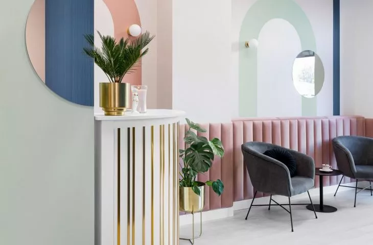
The salon's offer is extremely rich - when metamorphosing this place it was very important, the challenge was to create rooms and corners, the interiors of which will be maintained in different moods. We began work on the project by creating a color palette. We deliberately decided on contrasting shades of green and pink, complementing them with navy blue. The whole is connected by geometry, which appears on the walls, but also in the furnishings. - explain authors Daria Bolewicka and Daria Skoczylas.
The architects decided on contrasting shades and geometric shapes
Photo: Jakub Nanowski / perspektywa.net.pl © bo/sko
Crossing the threshold of the salon, one can see the reception desk and the logo cut in brass sheet metal, placed on sage-colored paneling. There are armchairs in the small waiting room, and the wall is finished with upholstered panels, above which the architects hung mirrors and lamps. A characteristic element is a curved wall finished with wooden rollers, which separates the hairdresser's workspace. A glass door in a metal frame leads from the reception area to the hairdressing section. Two stations located in the central part of the room are formed by custom-made mirrors and original barber chairs.
In the words of the architects:
The salon also offers manicures - in an alcove to the left of the reception desk, we created a cozy place for clients and salon staff. We decided on a monocolor - the walls and panels on the wall are pink. The contrast is the curved wall separating the hairdressing section. The pedicure room is kept in a similar climate - hidden behind a curtain to ensure the comfort of salon clients.
The interior of the massage room is kept in darker colors
photo: Jakub Nanowski / perspektywa.net.pl © bo/sko
The narrow hall has been optically enlarged thanks to painted geometric shapes and the placement of semicircular mirrors on several levels. The corridor leads to two offices - massage and beauty treatments. The massage room is a place of relaxation and tranquility, so the architects decided to use dark colors. The window is obscured by a curtain, and the eye is drawn to a wall with geometric graphics. Circles, rectangles, semicircles in various shades of green, navy blue and pink make up the composition, occasionally brightened by mirrors. The beauty salon, on the other hand, is a completely different world - in it the work of cosmetologists focuses on the face of clients, so the interior had to be bright. Pink, beiges, shades of nude color, determine the aesthetics of this room, and geometric shapes appeared again on the walls, referring to the aesthetics of the entire salon.
The beauty salon's offer inspired the architects to create a variety of interiors
photo: Jakub Nanowski / perspektywa.net.pl © bo/sko
Dobrawa Bies: Where I Like differs from typical (white or glamour version) beauty salons. Was it easy to convince investors for such a bold design?
BO/SKO: The aesthetic that is commonly associated with beauty salons is far from ours - we knew from the beginning that glamour style was out of the question :) Dominika's investor didn't have to convince us too much - she's a brave and energetic person, after the first meeting we knew that typical white would not fulfill her dreams.
Dobrawa: What did the investor expect and what were the design assumptions and inspirations?
BO/SKO: The unquestionable challenge was time - we had very little of it, but thanks to the investor's full trust, we managed to create an uncommon space. The interiors of Where I Like It were intended to be distinctive, feminine and cozy. We analyzed the salon's offer - with its diversity it inspired us to create different moods, hence the rich and intense color palette. Warm colors, shades of pink, circles are our interpretation of femininity, which is complemented by cooler colors and simple geometric shapes.
The interiors of Where I Like were intended to be distinctive, feminine and cozy
Photo: Jakub Nanowski / perspektywa.net.pl © bo/sko
Dobrawa: One of the most important elements that build interiors is color. Where did this decision come from? Can color affect the mood of customers?
BO/SKO: As I mentioned at the previous question - thanks to the extensive color palette, we were able to create interiors with different atmospheres: completely different impressions accompany customers at a massage, where the interior should be darker, and what is expected in a place where skin or hands are taken care of. Definitely, color builds mood and that's what we used in this project. We deepened this effect by using color in a variety of materials and textures: on the walls the color is painted, it is found on velour panels, curtains, leather furniture or specially cut wall panels. Mirrors appear in many places - enlarging the space and creating further compositions.
Flesh colors, shades of pink and circles are, according to the authors, an interpretation of femininity
Photo: Jakub Nanowski / perspektywa.net.pl © bo/sko
Dobrawa: Does designing the space of offices, for example, such as this one, follow different rules than designing the interior of apartments? Which is easier?
BO/SKO: We approach each project very individually, whether it is a private or public space. Definitely with public interiors, you can afford to do more - the space has to be distinctive to put the user in a certain, unforgettable mood.
Dobrawa: Thank you for the interview.
