Design is a constant search, and when we add to this process a fair amount of artistry and courage of the investors, unconventional, progressive, unique things are created. This is also the case of Sylwia Gaczorek 's Warsaw hair salon , created by the team of Jan Sikora's Gdansk-based studio. Avant-garde space? Loft interior? This place cannot be closed in any of these drawers. It's a real experiment!
The interior of a trendy hair salon in downtown Warsaw looks unfinished
Photo: Tom Kurek
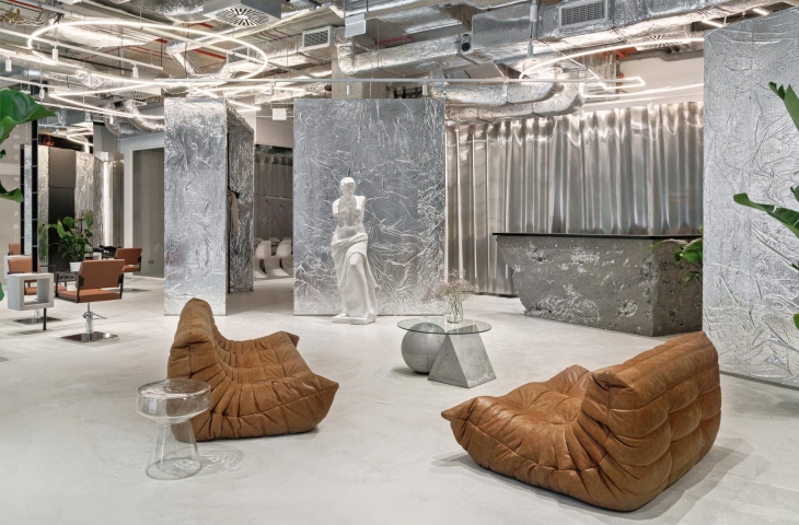
The interior of a fashionable hair salon in the center of Warsaw looks unfinished - the walls are clad in raw drywall, with putty joints visible in places, part of the concrete floor is splashed with paint, and the reception desk is behind a countertop of crumbled, porous concrete. What's the point here?
We heard the best compliment about this interior after the opening: "And when will this interior be finished?" The answer is one: never. Unfinished is the answer to a truly artistic and trend-setting space," explains Professor Jan Sikora, owner of the Sikora Wnętrza Architektura studio responsible for the interior design of the showroom on Chmielna Street.
The reception area of the hair salon is located behind a countertop of crushed, porous concrete
Photo: Tom Kurek
Against this seemingly chaotic background, the eye is attracted by thoughtful solutions - silver blocks dividing the space - and intriguing details, including sculptures referring to the ancient classics and an expressive painting inspired by the work of Jean-Michel Basquiat.
In the barber's section, a space has been set aside for a billiard table
photo: Tom Kurek
Jan Sikora talks about the design process, the idea of an unfinished interior and the design of photogenic spaces.
Ola Kloc: Sylwia Gaczorek's hair salon is far from the style typical of the beauty industry - it is raw, artistic and very, very surprising in places. How was this unusual vision created?
Jan Sikora: Exactly, this is exactly the effect we wanted to achieve! We suppose that there is no other hair salon like this in Poland, the appreciation of this project in the world (second prize in the international competition "Rethining The Future") shows that also outside our country it can be seen as something special.
The origin of this concept was primarily the investor herself, whose personal expression and courage provoked us to go progressive. So it was to be surprising, a bit austere, but nevertheless with a distinct touch of elegance. Many variants were created, but in the end, together with the investor, we chose something that is very calming in color, but has a lot of strong textures and expressive contrast, such as raw concrete combined with an elegant leather sofa. In a way, it's the author's style mixing industrial with minimalism and the recently popular neo-antique.
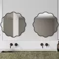
An unusual mirror in one part of the living room
Photo: Tom Kurek
Ola: Probably the most distinctive element of the interior is a wall draped with something that resembles sheets of aluminum foil. What is this material? What effect did you want to achieve?
Jan: It's simply an insulation mat, or metallized construction foil. The whole project is a great experiment and the use of such a material is a perfect proof of that. The most dominant part of the living room is the two large cubbies angled against the walls. We wanted to emphasize them, but not too aggressively, so we decided on something very reflective, but not like a mirror. So we chose foil, it was perfect because we could crinkle it a bit like fabric, which made it look more interesting and fit in with the raw character. Some even say it refers to the silverware used when dyeing hair! This interior is also an homage to Andy Warhol's Factory - who knows this space, knows what a loft interior really is - far from cliché, and close to the idea of experimentation.
As decoration, the architects used crinkled insulation matting
photo: Tom Kurek
Ola: You mentioned at the occasion of our last conversation that you dream of returning to doing abstract designs, this one seems to be close to those notions. Were there moments when the developer said "stop"?
Jan: Fortunately, no! We have to admit that the investor bravely accepted every idea from building foil on cubicles, to a metal sculpture of curtains to a floor splashed with different colored paint. The project looks abstract and that's what we mainly wanted, but it's further a functional hair salon (one of the best in Warsaw!), a public space, so at the level of implementation we had to face many problems. Fortunately, thanks to the use of many original elements and cooperation with sculptors (yes, it's a hair salon where you'll find real sculptures!) we managed to create something unusual and unorthodox, which at first glance doesn't look like a typical hair salon. In addition, the interior was designed to look unfinished - this is also an important idea that we intend to develop in future projects.
Sixteen hairdressing stations and a separate barber area were planned in the salon
photo: Tom Kurek
Ola: Given the social media popularity of the salon's owner, Sylvia Gaczorek, I imagine the interior had to be "instafriendly." Is creating photogenic interiors a new design challenge?
Jan: Instagram and social media are strongly influencing our industry, on the one hand we try to fight it, because, however, we operate in a space that is three-dimensional and affects many senses, and on the other hand we want to be flexible and follow trends. The salon, of course, had to be photogenic and instafriendly, but that was no challenge for us! The human eye loves contrasts and that's what we provided. In addition, we added some surefire touches, like the Togo sofas and a very catchy Venus de Milo sculpture, which has now become the most photographed spot in the living room.
The sculptures in the interior are among the most photographed details
Photo credit: Tom Kurek
Ola: What are you most satisfied with in this project?
Jan: I think ultimately we are most satisfied with the opportunity to create an experiment. We were able to go beyond everyday design and look for new material possibilities, and make many new contacts with other artists. In addition, we actively participated in the creation of the interior - we created a beautiful splash floor ourselves with the investor, it was something really great!
Ola: Thank you for the interview.
The paint on the floor was splashed together by the designers and the investor woman
Photo: Tom Kurek


