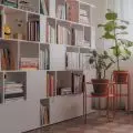
In Warsaw's Śródmieście district, on the corner of Emilia Plater and Wspólna streets, in a four-story building from the late 1950s, Karolina Kulis of Studio Kulis designed the space of a small apartment. Its arrangement was inspired by the colorful interior of Villa Le Lac, which Le Corbusier created for his parents almost a century ago.
The simple facade of the building, located on a street intersection in the center of Warsaw, is rhythmically broken by vertical, angled bay windows with French windows and balconies. This treatment not only allowed to diversify the façade, but most importantly to illuminate the interiors of the apartments.
inspiration from modernism
Starting in the design process from an analysis of the building itself, the designer looked for inspiration in the works of great modernists, and that's how she came across photographs of the aforementioned Swiss Villa Le Lac.
© VillaLeLacLeCorbusier
I was enthralled by everything about it: from the old sketches of the communication layout, to the color scheme and, most importantly, facing the whole thing towards the sun thanks to the panoramic windows. It was not necessary to convince the clients of the whole idea, they liked the idea of creating a very colorful design. In particular, the lounger with bent tubes reminded the client of her dad's first job, where he sold Cesca chairs designed by Marcel Breuer as a sales representative. This information made it impossible to miss this piece of furniture in the final design," explains Karolina Kulis of Studio Kulis.
The cohesive whole is maintained in bright, warm colors and natural materials
© Studio Kulis
functional and cozy
The existing layout of the apartment required correction - a new functional division was introduced, completely changing the location of the kitchen. The wall between the former kitchen and living room was demolished, thus creating a sizable space (which can be separated from the rest of the apartment thanks to bright curtains) housing the kitchen, dining room and living room. In turn, a bedroom was arranged in the place where the kitchen was previously located.
projection of the apartment, on the left before renovation, on the right after reconstruction
© Studio Kulis
In the bathroom, a skylight illuminating the interior was retained, with the use of decorative glass, which is currently fashionable. On the other hand - in the bedroom - the skylight was highlighted with a simple frame in dark blue.
Although the apartment is intended for rent, the owners were keen to create a warm, homely atmosphere in the studio and furnishings that allow for comfortable everyday functioning. The cohesive whole is maintained in light, warm colors and natural materials, which the architect, inspired by the design of Le Corbusier, broke with strong spots of color - a maroon bed frame or furniture and wall in the kitchen in the same color, navy blue walls in the hallway and the already mentioned blue frame of the skylight.


view from the living room to the bedroom and hallway
© Studio Kulis
To meet the functional expectations of potential users, the architect tried to make maximum use of every inch of the apartment:
The bathroom has a large shower stall, so the washing machine was moved to the bedroom and tucked into the closet. Next to the kitchenette is storage for household items such as a vacuum cleaner or a mop bucket. The two modular poufs are in two colors to make it easier to tell them apart, as one is foldable and can be used as a bed, and the other contains storage for extra bedding, the designer enumerates.


view from the bedroom to the living room and kitchen
© Studio Kulis
The aforementioned seats face the glass bay window, although the views are certainly different from those from the windows of a Corbusier villa (hard to compete with Lake Geneva!), such a solution and a space divided only by light curtains seem to be the author's symbolic nod to the modernist idea of free plan and the importance that architects placed on illuminating apartments with natural light.


