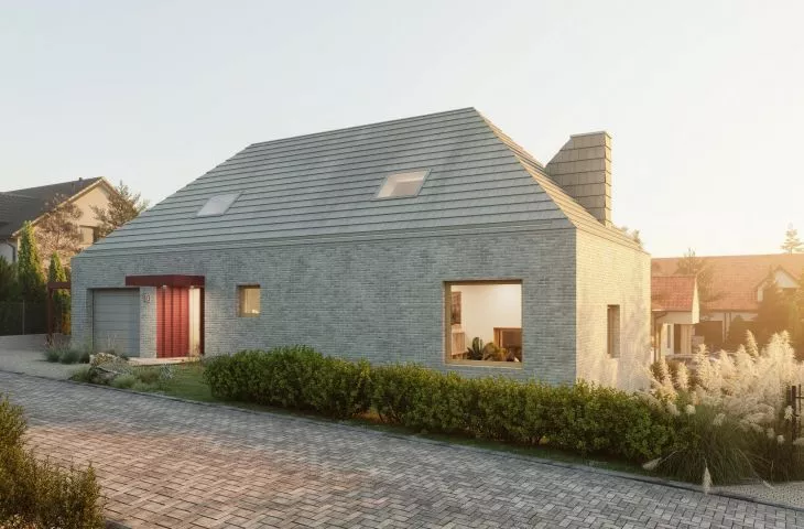
Among a dense development of single-family houses in a village near Gdansk, architects from the PB/STUDIO studio designed a bright, monolithic block integrated into the difficult, uneven terrain of a plot with a considerable slope. How did they overcome this challenge?
The single-family house, although of traditional form (rectangular plan, covered with a hipped roof) and finish (facade made of hand-formed brick and flat tile), stands out with its irregular arrangement of modern, large glazing, color accents highlighting the entrance and a shed attached to the block, and an interesting solution for the fifth elevation.
The 


monolithic block opens from the garden side
© PB/STUDIO
Jakub Piórkowski, architect from the PB/STUDIO studio, talks about the project and the challenges involved.
Ola Kloc: What was the priority for investors?
Jakub Piórkowski: From the investors, as a guideline, we got, among other things, a functional program - without much extravagance, it was to be a house for a young family, a terrace and a nice garden accessible from it. An additional guideline was a place to work from home, for example, on a mezzanine, which is related to the recently popular remote working model. Plus a sloping plot and a densely built-up neighborhood.
first floor plan
© PB/STUDIO
Ola: The body of the house follows the unevenness of the plot, what were the challenges of integrating the building into the topography of the site in this way, and how did this translate into the interior design?
Jakub: Integrating the house into the found terrain and seamlessly connecting the various zones was a kind of puzzle to be solved. In the end, we managed to enclose the whole thing in a very simple and functional layout. The living area is lowered in relation to the level of the entrance by half a storey, thanks to which we have a significant room height (more than four meters) and an additional mezzanine with a place to work.
cross-section
© PB/STUDIO
Ola: The roof and elevations are covered with light-colored flat tiles and hand-formed brick of similar color. What effect did you want to achieve by using such colors and materials?
James: We wanted to use traditional materials, but in a modern way. The similar color scheme of the facade and roofing makes the building work as a whole. We wanted it, with its streamlined form, to stand out among the surrounding uncluttered and very diverse buildings. This monolithic building block opens up towards the garden thanks to large glazing, and is further broken by color accents in the form of an emphasized entrance to the building or an attached shed.
left: view from the street; right: view from the garden
© PB/STUDIO
Ola: The chimney and dormers protruding above the roof slope are also covered with gray flat tiles, thus creating a very original shape of the fifth elevation, where did you get the idea for such a solution?
James: In this case, the multi-slope roof is a guideline of the local plan. Shaping the slopes in such a layout makes the fifth elevation highly exposed, and we didn't want the elements protruding from the slope to be accidental or treated as unwanted :) Emphasizing the chimney and dormer and finishing with tile makes us perceive the building as a whole, and these "extra" elements become a coherent part of it.
Left: chimney clad with flat tile ;Right: exit to terrace
© PB/STUDIO
Ola: What was the most difficult part of this project, and what are you most satisfied with?
Jakub: The most difficult challenge was to integrate the building into the plot we found, both because of the topography of the land and the densely built-up surroundings. In the end, it was these difficulties that we managed to turn into the main strengths of this project. Despite the small footprint, we obtained nice living spaces, including a living area of above-average height, open to the garden. I think we managed to make optimal use of the conditions we found.
Ola: Thank you for the interview.


