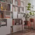
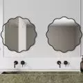
35 meters of clean and well-designed space. And aninterestingsimple detail. The main goal, according to the architects - Natalia Doraczynska and Olga Panek of NOD Studio. - was to create the perfect proportions for each function and an open plan of the apartment. The kitchen became the dining room, and found its own place on the bathroom wall. The bedroom, thanks to its subtle separation by a glass wall during the day belongs to the living area, while at night it is a comfortable and intimate zone. The impractical layout of the bathroom has been changed with the location of the door, which has managed to hide in the closet row in the bedroom.
plans of the studio
pic. © NOD Studio
AnnaPopiel-Moszyńska: The small one-bedroomyou designed in Warsaw's Mokotów district appears to be much larger than the 35 sqm given on the floor plan. To what do you think such an effect can be attributed?
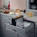
NOD Studio: Wetriedtodoanyzoningresulting from the functional design very conventionally, so that no rigid boundariescouldbefelt. The kitchenettebelongs to the created cubicle, in the middle of whichthere is a bathroom anda row of closetsaccessible from the bedroom. The opticalenlargement of theapartment was certainlyhelped by theunification ofmaterials and colors used.An importantpoint isalso the glass wall, which only physically separates theliving room from the bedroom.
The kitchen cubicle and a section of the bedroom
photo. © Martyna Rudnicka
APM: As I mentioned, the square footage is small, but you managed to fit many large, capacious cabinets into its space. Smooth planes of doors with almost invisible divisions fill the entire height of the rooms. Is this your way of organizing the space or a specific requirement of the investor?
NOD Studio: In our projects we putfunctionalityfirst, on asmallspace therightamount of storage space is the basis for us. The second important point is the visual side of the project, we really like anorderlyspace that gives you breath and allows you toreach astate of relaxation.
A glass wall optically enlarges the space
Photo: Martyna Rudnicka
APM: Your project, thanks to its frugal form and color scheme, is very consistent. The apparent "dullness" is broken by original details and design elements. Which element of the interior do you like the most - was it perhaps the starting point of the whole project?
NOD Studio: In the case of this project,wewantedtorefer to the surroundingarchitecture. The place where the apartmentislocated is very modern,evensurreal. The elements thatwereincluded inthe interior as awholeforma finishedwork for us, butwefeltthe greatest infatuation with theWästberg w171 almalamp collection .These timeless lampssuitedusvery wellto the concept,whichwewantedtokeep calm and harmonious.
APM: Thank you for the interview.
interviewed: {tag:AuthorAiB}


