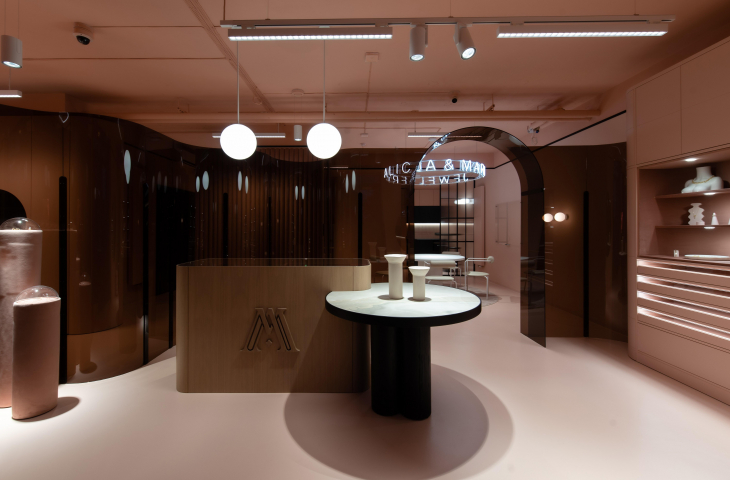
Damian Kozlowski and Katarzyna Fiedorczuk of 74studio are the authors of the recently opened showroom of the jewelry brand Alicja&Maria Jewellery in Bialystok. The interior, which refers to the company's corporate identity, has been divided by a special screen made of arylic glass, and all the furniture, walls and floors are kept in shades of pink.
The investors approached architects from 74studio with a request to design a boutique combining an office with the function of a show space, where their brand's jewelry will be presented.
An eye-catching main display island was made of veneer
Photo: Patryk Lewinski © 74studio
Alicja&Maria Jewellery is particularly about fashion jewelry, but there are also classic offerings. As owner Alicja Król-Romanowska says, the brand was created out of love for beautiful things:
In the beginning there was the question of what women in Poland would really like to wear and why they would want to wear it. Hence, there are minimalist designs, as well as more daring ones that will add character to the whole styling. Thus, we have created a balance between fashion and comfort.
portal leads to the office part of the boutique
photo: Patryk Lewinski © 74studio
interior in harmony with the brand
The design guidelines were quite clearly defined - the interiors of the showroom under construction in Bialystok were to refer to the visual identity of the brand, based on simple, classic compositions and shades of pink. The designers' task, was to develop and emphasize what the brand wants to offer to clients and customers.
Alicja&Maria Jewellery showroom projection
© 74studio
I have always believed in the fact that the interior is a kind of experience and very much influences how we perceive a brand. So I am of the opinion that interior design should be put on a par with marketing and treated as its basic building block. I am all the more pleased with the realization of this project, because we had a chance to present all our ideas in it, planning the space from the functional layout through the juxtaposition of materials, ending with the sublime details of furniture and spatial forms," says Damian Kozlowski, owner of 74studio.
The boutique is dominated by round forms
photo: Patryk Lewinski © 74studio
distinctive forms and pink
The designers had at their disposal a premises of one hundred square meters, where they planned space for the office part - consisting of a conference space, four workstations, the main office, a kitchenette and a bathroom. The boutique section, on the other hand, is a representative space located at the front of the boutique. It forms a foyer that leads through a designed portal to the office part.
the exhibition part of the boutique
Photo: Patryk Lewinski © 74studio
The main goal of the architects was to achieve an interior strong in expression and color. The paint and epoxy floors, as well as most of the built-in furniture, are kept in shades of pink. Mono-colored built-ins are partition forms and combine with the division of the functional layout. With this solution, the authors have delineated different places in the boutique and given them a function. An eye-catching main display island was made of veneer. A table for the presentation of selected jewelry is also adjacent to it.
A transparent screen with a rounded form divides the space
photo: Patryk Lewinski © 74studio
transparent screen
When creating the project, we were looking for a solution that would allow us to divide the space while giving a sense of transparency. We didn't want to escape into standard solutions by creating partition walls, nor did we need more furniture. Instead, we wanted something original and unusual to appear in the interior [...]," says Damian Kozlowski.
The interior was divided by a screen of tinted acrylic glass
Photo: Patryk Lewinski © 74studio
The screen separating the spaces of the boutique turned out to be such a solution. Designed as a free-standing structure of tinted acrylic glass, it is the most important element and decoration of the entire interior.


