Roksana Gleizner and Agnieszka Laska from the Faculty of Architecture at Wrocław University of Technology, in response to the competition challenge of the 17th Architecture Student Contest organized by Saint-Gobain, designed a dormitory and spaces for work and recreation on the site of a former factory in Warsaw. Their concept received an honorable mention in the Design category in the national stage of the competition!
The competition task was to prepare a concept for the revitalization of a plot of land located in the vicinity of the Warszawa Wschodnia railroad station on Berka Joselewicza Street. The site includes a former factory building under conservation protection - participants had to propose its renovation and additionally design a dormitory located in the neighborhood. The proposed solutions had to be in line with the vision of a climate-neutral Warsaw 2050 and the vision of the #Warsaw2030 strategy.
The task was to design new functions for the former factory and the dormitory
© Roksana Gleizner, Agnieszka Laska
space for the young
During the analysis, we focused particularly on the communication of the area, due to the need for good access to universities and colleges, as well as first-demand services among young people. Our design priorities were such aspects as privacy, the creation of numerous spaces open to the needs of the residents, where one can both integrate with other users of the building and bet on the individual realization of their needs. We focused on creating a space that would be friendly to both singles and couples or people with children," explain the authors.
Comfortable paths connect the spaces of the entire establishment
© Roksana Gleizner, Agnieszka Laska
service and residential complex
Within the area of the designed building, Roksana and Agnieszka placed numerous zones that enable and facilitate the work of students of different majors, starting from humanities, through arts and ending with sciences. The body of the entire establishment was created by creating, surrounding the existing building , a first floor with numerous penetrations to facilitate access to the interior through numerous pedestrian paths.
first floor plan with zoning
© Roksana Gleizner, Agnieszka Laska
On the first floor, we designed numerous common areas and service rooms creating semi-public zones such as a café, laundry room, gym, beauty salon. We took into account all the needs of young people's daily life and turned it into an independently functioning service and residential complex," the authors add.
Wide terraces were created on the +1 level
© Roksana Gleizner, Agnieszka Laska
spot development
The next design stage was the shaping of point buildings on the upper floors. In this way, the students of the Wroclaw University of Technology wanted to provide users with better lighting for the apartments and ventilation of the premise. Depending on the type of housing units, there are nine or six of them on a single floor of a point building. In the less favorable parts of the punctual buildings, on the north and west sides, the authors envisioned glazed work rooms for students. What's more, wide terraces have been created on the +1 level with the authors' lounge furniture, creating relaxing enclaves.
different types of student apartments
© Roksana Gleizner, Agnieszka Laska
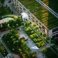
green inner courtyard
An important aspect for the authors was the development of the inner courtyard - particularly important in terms of user integration.
We decided to divide it into zones by means of extensions of the axes coming out of the body of the establishment. In this way we obtained a grid of numerous paths facilitating access from one part of the establishment to another. The grid also separated green spaces for us, which we enriched with plant pots and designed leisure furniture," explain Roksana and Agnieszka.
The green inner courtyard
© Roksana Gleizner, Agnieszka Laska
The inner courtyard's design also includes community gardens with greenhouses, leisure terraces located close to the catering areas or an open-air cinema with separate hearth areas. There is also a covered pedestrian path under the arcade, as well as a jogging track around the inner plaza, along the line of the building.
The former factory has been given new functions
© Roksana Gleizner, Agnieszka Laska
renovation of former factory
The competition task was also to renovate the old factory building. The students proposed to create a representative space in it for the entire designed building. They decided to leave the original, restored facade, whose arched shape of the windows was also the inspiration for the entire design and aesthetic concept.
The former factory offered spaces for learning and creative work
© Roksana Gleizner, Agnieszka Laska
Inside the factory, the designers created three main zones: an information zone with a reception desk, a representative zone with glass rooms for student work, and a gastronomic zone - a semi-public zone, where a restaurant is located with a glass mezzanine on the first floor, which offers a view of the entire building.
The authors proposed solutions for the entire competition area
© Roksana Gleizner, Agnieszka Laska
industrial atmosphere
Our main aesthetic goal was to preserve the atmosphere of the post-factory building. We decided to leave the brick previously featured on its facade and refresh it by giving it a sandy color. We also reproduced this material on the first floor facade of the designed building. Subsequent floors of the scoring buildings gained an industrial look through the contrast of materials we used - black perforation sheets and white plaster. The perforation panels surrounding the windows of the residential units, cut in the shape of the title arches, refer to the shape of the windows in the existing building, the authors conclude.


