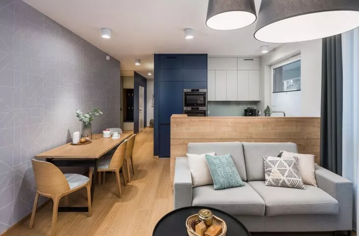
Modern design, comfort, interesting and practical solutions - this is how one can briefly describe a Poznan apartment designed by Joanna Sztorch-Wysocka and Magda Totleben of the InDe Projekt studio. Strong navy blue and geometric patterns add character to the interior. We invite you to come inside!
In one of Poznań's housing estates, a 67-square-meter apartment is located on the first floor of a building. From its living room, as well as from the bedroom, homeowners can go out to the backyard garden. To adapt the space to the needs of a family of four, architects from the InDe Projekt office made changes to the original developer plans. They enlarged the kitchenette, changed the layout of the bathroom and laundry room, and the location of the entrance to the bedroom.
The apartment is characterized by practical solutions
Photo: Bartek Bielinski © InDe Projekt
grenade as a leitmotif
The investors wanted modern interiors, finished with materials that are easy to keep clean. This is especially important with two small children. Joanna Sztorch-Wysocka suggested universal vinyl panels on the floor and a neutral color base. On this basis she built the interior design - simple furniture forms, graphic patterns and one stronger leading color, navy blue.
Garnet is a recurring color in the apartment
Photo: Bartek Bielinski © InDe Projekt
contemporary and comfortable
The 24-square-meter living room, combined with the kitchenette (enlarged from the original plans), forms the living area. The fronts of the kitchen cabinets are kept in the same colors as the walls (navy blue and gray). In order to separate the two zones: kitchen and lounge, the designer introduced a separating wall. Made of laminated boards in the color of natural oak, it visually harmonizes with the wall in the living room. As a result, the owners gained additional storage space and a worktop in the kitchen. Next to the kitchen, along the wall with wallpaper in a maze pattern, stands an oak table, which can be unfolded in case of more visitors. It is accompanied by classics of Polish design - chairs A-1801 ARCH by Fameg.
The dominant feature in the living room is a built-in TV wall
Photo: Bartek Bielinski © InDe Projekt
The dominant feature in the living room is the furniture arrangement of the TV wall. The custom-designed bookcase was made of black and navy blue lacquered and oak veneered panels. A bio-fireplace gives the interior a cozy feel, while capacious lockable cabinets provided space for personal belongings. The lounge furniture fit perfectly into the living room space. The sofa stood by the wall separating the living room and kitchenette. The whole is complemented by a large pouffe, which is both a seat and a table.
The bedroom hides behind a built-in corridor
photo: Bartek Bielinski © InDe Projekt
URKY BEDROOM
The entrance area was carefully thought out in terms of design. The built-in system accommodated a capacious closet for clothes, a family closet, roomy drawers, as well as a seat upholstered with navy blue velour. A white wall also conceals the entrance to the parents' bedroom. The bedroom resembles a luxury hotel room - this is what the owners dreamed of. The most important piece of furniture - a double bed, is crowned by a velour upholstered headboard reaching the ceiling. A capacious closet occupies one of the walls. The bedroom also has room for a dressing table with a modern round mirror. And good lighting is achieved by decorative lamps.
The leitmotif of the bathroom is rhombuses
Photo: Bartek Bielinski © InDe Projekt
geometric bathroom
The dominant motif in the bathroom is rhombuses and strong colors. The architect juxtaposed Italian tiles with black stoneware encasing the bathtub and black closet fronts with diamond-shaped openwork, which act as handles and ventilation at the same time. The whole interior is warmed by wood-colored accessories - vinyl panels, part of the furniture development over the toilet and the cabinet under the sink. Despite its small size, the bathroom accommodated not only the bathtub, but also a shower with a shower tray inscribed in an alcove.


