Sunny, colorful and original - such is the apartment for rent on Rajska Street in Cracow. It was designed by architects from the Warsaw office Beza Projekt. Anna Loskowicz is interviewed by Malgorzata Tomczak.
Malgorzata Tomczak: The cool colorful apartment on Rajska Street in Krakow is your new project. What was the most difficult thing about working on this task, and how was the cooperation with the investor?
Anna Loskiewicz: Designing a space for rent is a little something between designing a hotel and an apartment. It is certainly an interesting challenge. The investor had a clear vision of what he expected, so the cooperation went smoothly - the biggest challenge was to develop the ergonomics of the kitchen development.
Margaret: There is a very interesting choice of finishing materials in the apartment, especially in the kitchen or bathroom. What was the reason for that?
Ania: Finishing materials are very important to us - as the name suggests - they are the ones that finish and create the final image of the space, we look at them and touch them.
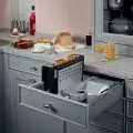
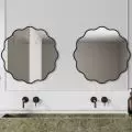
We don't like to deceive the user, so we rely on real wood, stone or their interesting transformations, but ones that don't pretend (for example - tiles that imitate wood are solutions that are alien to us). So we have French oak herringbone on the floor, terazzo in the bathroom, plus glass details and a cabinet handle also made of terazzo, the kitchen built-in is milled and lacquered MDF. We like textures - we try to avoid synthetic planes of color.
The front of the kitchen
Photo: Jacek Kolodziejski © Beza Projekt
Margaret: The living room is a classic bourgeois living room - round table, chairs, parquet floor. What was the basis for this decision?
Ania: It's a timeless solution - the large number of windows also somewhat imposed this solution. Besides, we didn't want to place the sofa with its back to the window. The round table is a democratic solution and an ideal place to sit with a glass of wine after a day of sightseeing.
Margaret: The colors are bold and quite trendy. The wall in the hallway resembles an abstract mural, giving the apartment a nonchalant artistic touch.
Ania: The investor wanted a durable washable wallpaper in the corridor, we searched for a long time for a suitable pattern, but somehow nothing suited us, so finally we made a project ourselves, which is a bit of a summary of the colors that appear in the interior.
The colors are vibrant and strong - the space should be memorable and stand out among the many other offerings. At the same time, this energy is, in our opinion, a cool experience for users who use the apartment for a fairly short time.
Corridor wall - a composition of vivid colors present in the interior
Photo: Jacek Kolodziejski © Beza Projekt
Malgorzata: An ingenious navy blue piece of furniture clad in cracow "siding" goes from the kitchen and wraps around to the hallway. It gives a very witty effect. Didn't it reduce the hall space and take away daylight?
Ania: The apartment is very bright, with lots of windows. The corridor is long, using it for storage was a natural way - it was a shame to waste so much space just for communication. The closet also hides all the installations and faults on the walls. Thus, the space became organized and leveled. The walls of the corridor and bedrooms were moved so that sensible closets would fit and not clutter the space.
The projection provided by the developer was somehow not super thought out in this regard. We made many minor adjustments to the walls, door positions, etc.
So the final form of the development is also a result of the function - it is not just an aesthetic "see me". The whole created a harmonious space - without cornices, dodges and enclosed pipes.
interviewed: {tag:AuthorAiB}
- Bizzotto red chair
- Twice Black lamp
- Terrazzo cutting board
- Emmevi Piper undercounter faucet and spout
- Artisan Mallow pink tiles
- Ivi round table
- Mexico chair


