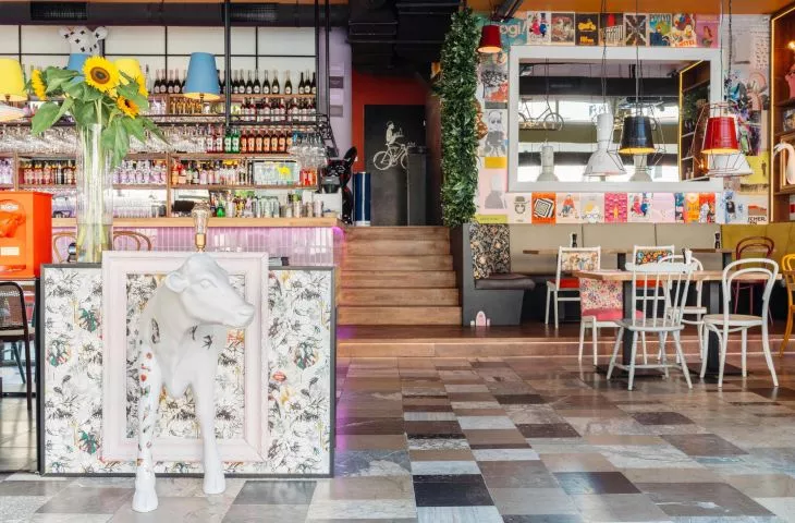
If the Mad Hatter - one of the characters from "Alice in Wonderland" - ran his restaurant, there's a good chance it would look just like Krakow's VELO Food&Bar. However, there is method in this madness! Despite the variety of colors, patterns, materials and the multitude of stylistic references, the whole is coherent, and a stay here is certainly one to remember!
Among the multicolored chairs, variously shaped lamps, different wall colors, patterned wallpaper and unobvious graphics (not to mention sizable animal sculptures!), you can sit comfortably over the comfort food served here - for carnivores and vegetarians. Architects from the Cracow studio Grycaj Design are responsible for the original interior design.
The creation of VELO at every stage was unconventional, as we had no single inspiration
photo by Pawel Sarota
Basia Hyjek: What was the main inspiration for this project?
Grycaj Design: We had in our minds a vision of an original space that was missing on the gastronomic map of Krakow. The concept evolved a lot and changed during the design work. The creation of VELO at every stage was unconventional, as we had no single inspiration. We wanted to move away from the cliché, we wanted to surprise, but also to create an interior in which everyone would feel welcome.
Basia: What were the investor's expectations and needs?
Grycaj Design: We have known and worked with the investor for many years, and each time we try to realize an interesting project, different from the previous ones. From the very beginning, the investor allowed us to be crazy, expected creativity, and gave us the green light to let our imagination run wild. At the start, we created visualizations, which were the starting point, but the final touches were made during the implementation. The most "flavor" came at the very end, during an intensely fruitful brainstorming session with the investor, who found a lot of young, fantastic avant-garde artists and decided to complement the space with their works.
during the realization of this project, it brought us crazy satisfaction to play with texture, color and pattern
photo by Pawel Sarota
Basia: Where did you get the idea for such a combination of colors, patterns and materials?
Grycaj Design: During the realization of this project, it gave us crazy satisfaction to play with texture, color and pattern. We wanted to juxtapose seemingly mismatched elements and contrasting colors. Later, it turned out that major fashion brands similarly create unusual boutiques that balance on the border of kitsch and surprise the customer from the very threshold. This reassured us that we were heading in the right direction.
Basia: What gave you the most satisfaction in creating this project, and what was the biggest challenge?
Grycaj Design: The entire creation process and the implementation time was great fun, but the most satisfaction came from seeing how the space "came to life" after opening. It was very satisfying to see what caught the most attention, which spaces were chosen first, how people felt when they were in VELO, whether they had the courage to be themselves #daretobeyourself.
the biggest challenge turned out to be the technical issues, so as to adapt the premises to the needs of gastronomy
photo by Pawel Sarota
The biggest challenge turned out to be technical issues, so as to fit the premises to the needs of gastronomy. The building formed the foundation for a car dealership, hence the large difference in levels between the consumption room and the space where the kitchen facilities are located. The original purpose also carried a lot of advantages, such as the ceiling height, large glazing and the open plan of the room.
