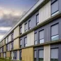
Krakow's townhouses hide many secrets. A building that from the outside may no longer impress, inside will surprise you with a richly decorated staircase. There are also tenements that immediately invite you to enter, thanks to bay windows, stone loggias or other original solutions. It was no different with this one from 1911, whose semicircular windows immediately catch the eye.
The apartment was kept in a light color scheme. It is broken only by design elements of a more decisive color encountered from time to time, such as a black stool or an original black and white lamp. Jacek Kolasiñski from the studio Loft Kolasiñski created a spacious, soothing interior that perfectly harmonizes with the unusual shape of the windows.
Basia Hyjek: What was the main inspiration for the project?
Jacek Kolasinski: In this case, it was known that the unique architecture of the apartment - especially the windows - would be the main decoration. The decision to arrange this space in an economical, minimalist way was obvious.
The decision to arrange this space sparingly, minimalist was obvious
photo by Joel Hauck
Basia: Where did the idea for such a selection of colors and materials come from?
Jacek: The furniture chosen for the project, had to be set quite low so as to create the right proportions for the largest windows in the living room. At the same time, the composition was dedicated to a woman, as the only inhabitant of this attic. The furniture is mainly classics of Danish design and designs of our studio. A very successful procedure, turned out to be the use of mirrored fronts for the closet in the hallway. The effect visually enlarges the space and further illuminates the corridor.
The materials and colors are mainly cement-lime plaster, natural oil-finished floorboards, as well as oak furniture. Also the color - a very light gray, or white broken with a minimal amount of black pigment. This is a very warm color, comfortable for users. In this case, we did not interfere with the layout of the apartment, the developer managed it perfectly. Only the bathroom was quite a challenge due to the very small square footage, and the client very much requested to plan a bathtub - we succeeded!
color - a very light gray, that is, white broken with a minimal amount of black pigment. This is a very warm color, comfortable for users
photo by Joel Hauck
The owner of the apartment is a very active professional person, practically all the time traveling around the world. Because of the epidemic, she had to spend a lot of time in Krakow. She called me to tell me that she is having a great time in her new apartment and that she finally has the opportunity to enjoy owning it. Of course, this is the biggest reason for satisfaction!
Basia: What was the biggest challenge in creating this space?
Jacek: The biggest challenge was working with the renovation contractors, it wasn't easy!


