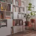
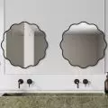
Designers from MO Architects faced a daunting task - transforming a small underground premises into a beauty salon. As a result, every inch of the interior was designed to make the best use of the available space and maximize the use of space, while maintaining a sense of spaciousness.
Thebeauty salon in Kolobrzeg was designed from scratch, the architects divided its interior into two rooms and focused on maximizing the flow of natural light.
As the architects say about the design work:
Due to the location of the room below ground level, our studio was faced with the challenge of maximizing the illumination of the small interior and adapting it for a service establishment - a beauty salon. The organization of the space of the office was designed from scratch, in the interior there were separated two independent rooms for performing treatments, a waiting room, toilet and social facilities. An important assumption was to optically enlarge the space, as well as to maximize the inflow of natural light from outside, which definitely improved the comfort of work. A key aspect was to give the interior a fresh and clean character, in which customers would be happy to stay.
The space was divided into two zones
Photo: Ayuko Studio, Aleksandra Dermont © MO Architects
Two zones have been set up in the main room - a waiting area for clients and a manicure treatment area. Both functions were separated by a vertical wooden part ition, which allows natural light to flow into the rest of the interior, while making the room itself optically larger. Decorative lamps have been hung in both treatment rooms.
Geometric tiles and a blue sofa add character to the interior
Photo: Ayuko Studio, Aleksandra Dermont © MO Architects
The strong blue of the sofa enlivens the soft color scheme of the interior. In both rooms, the architects designed built-in furniture and wooden wall cabinets for storing essential accessories, preparations and cosmetics. Thanks to the use of uniformly colored materials and a large mirror pasted into the wall, the space of the small bathroom is optically larger. The characteristic rhombus-shaped tiles perfectly fit into the modern concept of the interior, and the use of dark grout further emphasizes the geometric pattern of the material.


