Work submitted for the competition
"Best Interior Diploma".
The area subject to the study is a plot of land located in one of the oldest cities in Poland - Kalisz. The entire study is located in a part where single-family housing dominates. Significant for this area is the company of the "Kalisz Castle of Piasts" - archaeological reserve, where the historical buildings of the area were reconstructed. The aim of the project was to create a building and interiors that allow the development of a child's imagination through geometric and structural forms, through which a person at an early stage of development is able to develop imagination.
Design of a multidisciplinary kindergarten in Kalisz, solid.
© Natalia Banasiak
The premise was to move away from the typical kindergarten aesthetic that often uses haphazard and ad hoc interior treatments. The idea as well as the material and color assumptions were inspired by the work of Jan Tarasin - his paintings compositions influenced the interior architecture. The context in which the building is located and the immediate vicinity of the archaeological reserve were also used.
The project assumed the creation of a space that responds to the needs of the contemporary developmental model of teaching and raising children, as well as a concept that meets the technical and material conditions for this type of facility, using materials that are resistant to damage and facilitate the maintenance of the premises.
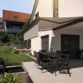
The terrace in the southeastern part of the kindergarten and the roof terrace
© Natalia Banasiak
The exterior color scheme stems from the environment, referring to the green of the fields, the blue of the sky, flowers and trees in the neighborhood.
After discussions with kindergarten staff, the target equipment, number and location and purpose of rooms in the building were determined. The layout of the rooms was designed to allow easy access for employees to all parts of the building, as well as to limit the zone where outsiders will be present.
plans of the kindergarten and layout of the rooms
© Natalia Banasiak
The layout of the premises allows the theater and cinema hall to be rented out, as well as the associated technical, sanitary and storage rooms. This will enable the facility to generate additional income. Thanks to this arrangement, we observe a controlled flow of employees, students and visitors through the building.
entrance area to general classrooms
© Natalia Banasiak
general classrooms
The rooms were designed to be used in a variety of ways. Priority was given to seating areas for children creating an area for conducting general classes on a variety of topics. Classes are conducted in various forms, so spaces were provided in the room to create a combination of equipment. A storage area for each student's private belongings and an equal number of seats are also provided.
common area
© Natalia Banasiak
common area
The focal point of the open common area is a carpeted section. Additional functions are concentrated around it. This is where the "base" areas for children were located. Made of round steel profiles and bent plywood, they form a stable structure attached to the floor and ceiling. The bases are a place to "hide" and use in many ways, provoke to invent more and more new games.
reading room - mobile seating area
© Natalia Banasiak
reading room
This place has two parts. The open one, where meetings and reading books together can take place. It is formed by mobile and modular seats in subdued colors, which allows any arrangement, depending on the needs. The tops of the room are crowned with white areas lined with material that allows people to draw on them with markers. This allows children to create their own wall mural. This fosters the development of creative expression unrestricted by the format of the sheet of paper. On the other hand, the enclosed part is formed by a structure elevated above the floor level, containing niches for seating and shelves for books and games.
dining room space
© Natalia Banasiak
dining area
The dining area provides for a serving area and an open space equipped with tables and seating. Between the tables are panels-paravans delineating smaller table sections. This allows children to focus, and the transparent material of the partitions does not interfere with the overall view of the room.
theater - projection room with stage
© Natalia Banasiak
theater
The room was designed in subdued colors, so as to provide freedom of scenographic arrangement and not affect the overall view of the stage. The space can serve several functions: cinema - a screen placed under the ceiling allows cinema projections organized within the scope and capabilities of the facility; theater - intended for children's performances on stage. The size of the stage and room has been designed so that children can become accustomed to the large space and the audience. The audience has the comfort of watching a performance thanks to seats that can be exchanged for chairs. So we can arrange the room as we wish, arranging the seats on steps that mark out the levels and provide a good view for everyone. As already mentioned, the space can also be rented, thanks to its convenient location.
Natalia BANASIAK
Illustrations: © Author


