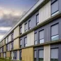
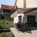
A house for lovers of mountains and winter sports was built in Puszczykowo, near the Wielkopolski National Park . The investors approached architect Agnieszka Deptuła of the SPACELAB studio, and the architect designed a coherent, minimalist interior, whose main theme is the textures used - walnut and stone.
The living room overlooks a slope overgrown with spruce trees
Photo: Moiz © SPACELAB
Dobrawa Bies: The project we are talking about is an example of minimalist-style interiors. What for you is its quintessence?
Agnieszka Deptuła: Minimalism in interiors is the art of subtraction, the ability to tone down visual stimuli for the future recipient. Paradoxically - subtracting values in one area - we gain something in another. For example: by eliminating an excessive number of objects or finishes in an interior, we increase the impression of peace and harmony in it, not to mention spaciousness. I often tell my investors that by designing their residential interiors in a minimalist way, we create a clean frame for their future daily life and the rush of everyday life. We find such uncluttered houses and apartments easier to embrace, easier to clean and easier to move around in. The quintessence of minimalism for me are contemporary Japanese interiors, the designs of John Pawson or Akira Sakamoto. These are ultra-simple forms, with the reduction of details to a minimum and exceptional handling of natural light let into the interiors.... This kind of pure style is "demanding" when dealing with everyday, typical family life, so we don't often get the chance to design in such a strict form. At SPACELAB, we try to balance well the scale of minimalism that we implement for clients in their residential interiors, because each project must be tailored to the user. We inspire the investors first, showing them the whole spectrum of solutions, so that in the end each of them can find himself in this scale of minimalism and define his "comfort zone" before starting the design.
The main materials used in the project are stone and wood
Photo: Moiz © SPACELAB
Dobrawa: The house near Poznań was designed for lovers of winter sports, hence the reference to modern mountain residences in addition to the aforementioned minimalism. Please tell us how the design work progressed, where did you start?
Agnieszka Deptuła: We started the interior design with the investors by talking about the plot itself, the climate of which strongly inspired them. Puszczykowo is located far from ski slopes, but the site had "that something" of a mountain climate from the beginning. There is a natural slope with spruce trees on the side of the garden, so the investors' request to be inspired by modern mountain residences was in keeping with the climate of the place for me - it was not artificial. At the very beginning we made adjustments to the positioning of the walls to improve the ergonomics of several rooms. The investor asked that the interior be "uncluttered, easy to clean and as simple as possible to rearrange for social gatherings," and we simply focused on providing the client with these solutions. We reduced what we could and designed many hidden cabinets. A design curiosity is that the elimination of free-standing appliances was such a strong need of the owners that we even discussed the appropriateness of placing large floor lamps in the living room. Fortunately, the investors allowed themselves to be convinced by our vision - which I am very happy about, because the lamps created a unique atmosphere in the lounge area.
Character is added by unusual lamps and armchairs
Photo: Moiz © SPACELAB
Dobrawa: In addition to these unusual lamps, the main theme of the interior is the materials used - walnut and stone. Please explain the design solutions. What was the biggest challenge?
Agnieszka Deptuła: Indeed, challenge is a good word - it was to maintain material consistency within the individual decors. In a nutshell, the difficulty was that several different textures finished with different technologies, had to look like one material in the end - that is, like "wood" or like "stone." We wanted the veneer for the American walnut furniture to match the wood of the floorboards used on the dining room ceiling. American walnut has a heavily carved pattern, and there can be quite a bit of variation from batch to batch - and we had to work out this consistency for the work of the carpenters and the flooring team, so that their walnut would match. The "stone" texture, on the other hand, occurred on three different surfaces and, of course, also had to look identical on them. The sintering in the kitchen, the floor slabs and the pattern of the furniture stone walls and cabinets are all three different technologies that had to look like one "stone" texture. We searched and tested a lot of samples at the time. With this challenge - custom-designed standing lamps were already a really simple task!
All interiors are kept in a consistent style
Photo: Moiz © SPACELAB
Dobrawa: How do you arrange the space of an apartment if you want to achieve visual consistency?
Agnieszka Deptuła: At SPACELAB, we focus on minimalist interiors. We persuade our investors to limit the main materials to a guiding two or three, and these selected materials are then coherently composed throughout the project. In the case of the interior in Puszczykowo, the leitmotiv was walnut and stone, and they intertwine from the living room to the bathroom. Being in a smaller room, we feel that it is an interior consistent with the rest of the house, that it is part of a larger composition. In our studio in Poznan we work a lot with the interiors of houses and residences - we create their atmosphere with large planes of texture or color. By doing so, we increase the visual feeling of the scale of the rooms. Of course, we then add details, elements that give uniqueness and personalization to the place, but our general rule for residential interiors is that the base implemented on the walls, floors or furniture gabarite is reduced to the possible minimum. Instead of designing a flurry of impressions in different zones - we create large, clean frames - scenes, which are then the background for selected details.
Dobrawa: Thank you for the interview!


