Katarzyna Dąbrowska and Julia Jendryca from the Faculty of Construction and Architecture at the Opole University of Technology have an idea for reviving the Helena Lehr square in Opole. The students introduced an installation in the form of a metal red line into the area, which, by defining the space, creates places for rest, play and interaction.
The presented project was created as part of the course Contemporary Architecture and Urbanism under the direction of Dr. Iwona Wilczek. The task was to develop an interactive object of small architecture within the Helena Lehr square, which is located in the very center of Opole. From the east it is adjacent to the Franciscan Church, and from the west to the Młynówka Canal. On the other hand, from the north, the site borders the busy Zamkowa Street. An additional design consideration was the use of a single material chosen by the students. The goal was to integrate the object as well as possible into the historic fabric of the downtown area.
The square is located by the Młynówka Canal in Opole
© Katarzyna Dąbrowska, Julia Jendryca
Unfortunately, most of Opole's residents do not enter the square, going around it from Minorytów and Zamkowa Streets. From our observations, the users of the square are mainly people who want to sit down and rest for a while, and people in crisis of homelessness who use the meals provided by the Franciscans, Katarzyna and Julia observed.
animation showing the project
© Katarzyna Dąbrowska, Julia Jendryca
red line
The students stressed that the square's greatest asset is its greenery, and its potential—its location within the city and the number of people who pass by every day. The goal of their design was to take advantage of the square's potential and create a space that would encourage people to spend time there. The main starting point for the design was the existing entrances to the square. The story they wanted to create was to redefine the existing, and little-used, path running through the area.
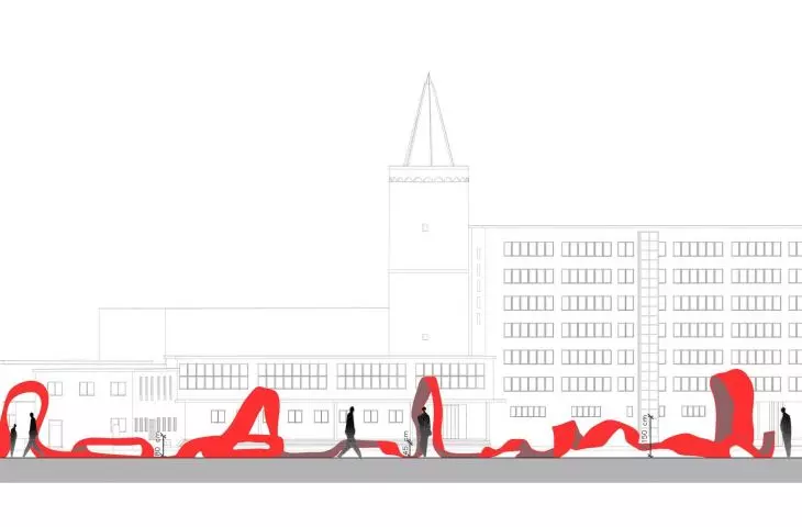
The authors introduced small architecture into the square in the form of a red line
© Katarzyna Dąbrowska, Julia Jendryca
The entire premise is defined by a red metal line, which with its variation in height or slope creates individual zones throughout the story we are spinning. The coherent form of small architecture includes all the functions both for existing users and spaces for people we would like to encourage to use the square, the students explain.
The square also includes space for play and walking
© Katarzyna Dąbrowska, Julia Jendryca
revitalize the square
The young architects proposed the main entrance in the form of a gate to encourage people to look into the square from the side of Zamkowa Street. The zone for the youngest users is marked by a twist of the red line, and right next to it is a place for their guardians. Further on, the running line refers in form to the Piast Tower, whose view the authors wanted to emphasize. The area also features an information board with a QR code.
The idea for the Helena Lehr square in Opole, function scheme
© Katarzyna Dąbrowska, Julia Jendryca
The introduction of a rest area, equipped with seats and tables, is a response to existing needs, but also an attempt to provide a new function for a wider range of users. The students also turned their attention to cyclists, proposing a parking space and a charging station for electric bicycles. They also designed lighting, which is currently lacking in the square.
The form of the ribbon is meant to encourage the use of the square
© Katarzyna Dąbrowska, Julia Jendryca
We believe that our concept is an interesting proposal for solving the space of the Helena Lehr square. It gives a new character, while respectfully maintaining the existing greenery. The form of the ribbon is an attempt to encourage users to create a new history, and its lively form will, in our opinion, invite people to enter the square. The ribbon's features both respond to perceived existing needs, such as tables and places for bicycles, and create entirely new points, making the most of the site's potential, the authors conclude.


