Near Kielce, there is a house for which Wiola Niedziela-Bogusz, an architect from the VNdesign studio, is responsible for complex solutions including the remodeling of the body and interior design. The project is characterized by bright, large spaces, the use of noble materials, garnet accents and Polish art that decorates the walls.
The investors dreamed of a large, open house with a sizable dining room, living room and kitchen
Photo: Yassen Hristov © VNdesign
Wiola Niedziela-Bogusz was involved in the project, already at the stage of creating the 340-square-meter house. She accompanied the investors from the very beginning - including obtaining a building permit and redesigning the facade. She also supervised the design of the surroundings, so that it remained consistent with the house, and the residents could enjoy watching the garden through the huge glazing.
The first floor features open spaces and large glazings
Photo: Yassen Hristov © VNdesign
large, open interiors
And what did the clients dream about? They wanted a large, open house with a sizable dining room, living room and kitchen. The basic condition was to incorporate a free-standing, unsupported staircase into the building's floor plan. The investors also asked for a change in the location of the study and for large closets in the entrance area. All these conditions required a redesign of the living area, including the removal of small rooms in the kitchen and dining area, which were in the original design. The house was also expanded.
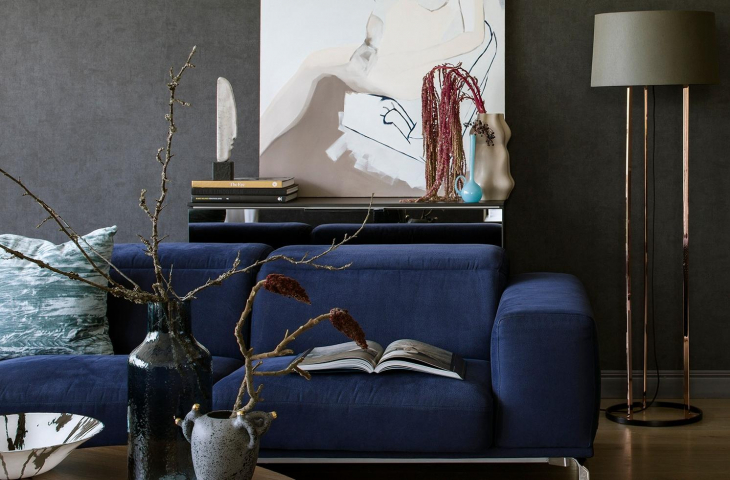
The client's dream was a large navy blue sofa
Photo: Yassen Hristov © VNdesign
Bright colors and a touch of navy blue
Theaesthetic requirements? It was to be a bright, simple, modern home with a touch of navy blue. The client's dream was a large sofa, precisely in this color. Since all these aesthetic requirements are very close to me, it was a lot of fun to work on the project. I love noble materials used in minimalist interiors. In this realization they appear in abundance: stones, sinters, Italian design and materials. Beauty lies in simplicity, this is my motto," says Wiola Niedziela-Bogusz.
The house is dominated by bright colors and additions of gold and copper. Particularly noteworthy is the navy blue colored oak floor, as well as the aforementioned sofa and the stone used in this color.
from left: first floor plan, floor plan
Photo: Yassen Hristov © VNdesign
The first floor is the living area, which consists of a living room, a kitchen with a dining area, a guest bathroom and a separate toilet. A free-standing staircase leads to the first floor, which is the night area. There, two children's rooms, a children's bathroom, a bedroom with a parent's bathroom and a dressing room have been placed. The laundry room and storage room are located on the mezzanine.
On the first floor there is a large bedroom with a dressing room and bathroom
Photo: Yassen Hristov © VNdesign
illusion and polish art
The biggest challenge? The most difficult procedure was to create an unsupported island in the dining room with a thickness of only 1.4 cm and a length of 350 cm. Giving up the support makes the island light in appearance.
The design challenge was an island without support in the dining room
Photo: Yassen Hristov © VNdesign
I also like the illusion created by hiding the utility section behind a mirrored wall. It is in it that the staircase and the island are reflected, making the living area seem even larger. My favorite room? It's the tiny guest bathroom located on the first floor, where I placed a beautiful free-standing sink, bocci lights and copper mosaic," adds the architect.
Anna Salak was asked to "dress the house" in art, and she selected both paintings, sculptures and accessories. The architect always tries to support Polish art, and it appeared in this interior.


