A small apartment in Cracow required Magda Załoga, an architect from Lokal Studio, to make considerable changes. In order to adapt it to the needs and expectations of the investors, it was necessary to redesign the existing layout of the partition walls and create a new space in which each household member would have his or her own corner.
a place of contrasts
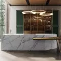
The 40-square-meter apartment, although largely bright and devoid of many decorative elements (the owners wanted to place only the necessary furniture and minimalist accessories that would allow them to modify the interior at will), is enlivened by the colors and details introduced by the designer - dark greendetails - the dark green low kitchen is juxtaposed with narrow, glossy tiles on the wall, the living room is decorated with a sofa upholstered with soft emerald fabric, designed by Florence Knoll, and a designer armchair in a strong red hue.
Excerpt from the kitchen and living room
Photo: Ayuko Studio
The bathroom, too, the designer writes, is a place of contrasts - the white walls are lined with small square tiles separated by strong lines of dark grout. Against the background of this geometric grid, the architect placed a narrow black radiator and an orange cabinet under the sink.
bathroom
Photo: Ayuko Studio
a place of harmony
Ola Kloc: What was the priority for the investors?
Magda Załoga: From the very beginning of our discussions, the main idea was to separate separate bedrooms and create a place for the child to work. The element that the owners had at their disposal was a closet that was more than a century old, which found its place in the children's room.
Ola: The apartment is only forty square meters, nevertheless you managed to separate the living area, bedroom and children's room. Did the existing functional layout require changes?
Magda: It's true, the apartment is only forty square meters and the original layout of the apartment required many changes. All partition walls were redesigned so that each resident would have his or her own separate recreation area. Getting a spacious and comfortable bathroom was also a priority. I make no secret of the fact that windows played a big role in planning the rooms. Their number and arrangement meant that we were able to build partition walls so that each room was well lit.
A more than century-old closet and an armchair from the 1970s.
Photo: Ayuko Studio
Ola: The interior is dominated by bright colors broken by strong color accents and original furnishings such as the distinctive red armchair from the 1970s and the already mentioned over-hundred-year-old wooden closet. What flowed into such a choice of colors, materials and textures?
Magda: The light colors on the walls and the muted color of the oak on the floor create a great base for the furniture, which is in strong, intense colors. For this project, I suggested strong colors, which the Investors accepted with enthusiasm. One of the elements, too, was the definition of the dominant colors in the interior, which helped maintain a sense of harmony. The color green dominates in the kitchen connected to the living room, where the representative piece of furniture is the Knoll sofa. The armchair from the 1970s was found on one of the portals with vintage things. The choice of furniture definitely reflects the character of the owners and their lifestyle.
Ola: What was the most difficult part of this project, and what are you most satisfied with?
Magda: I am extremely pleased that on these forty square meters we managed to plan a space that meets the expectations of the Investors, and at the same time the apartment is still light with quite good communication between rooms. After all, good, unobstructed communication in the apartment was a big challenge, but in the end we managed to solve this problem.
Ola: Thank you for the interview!


