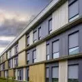
A strong accent, and at the same time a very good fit in the context of the downtown square and the neighboring church. This is how the new residential development at the Wildecki Square in Poznań looks like. Another successful project in a historic setting from Ultra Architects.
Market squares - the centers of historic districts annexed to the city in the early 20th century - are a hallmark of Poznan. One of them is the Wildecki Market. The square, with an irregular plan and a neo-Renaissance church from 1907 dominating it, serves as a popular city marketplace. Since the 1970s, the market has had sizable gaps in its two frontages: west and north. From the west, most of the old half-timbered buildings were then demolished. At that time there was also an urban planning concept for the broader vicinity of the market, designed under the direction of Piotr Wędrychowicz. It never came to fruition.
The Market Square development was gradually supplemented from the 1980s. By 1990, a successful postmodern residential infill with a bank on the first floor was built. The building, faced in part with brick, fit well into the eastern frontage of the square. At the turn of the century, development of the west side began. Three houses grew up here - also postmodern, but of inferior quality. They are tall, contrasting strongly with the preserved low half-timbered building and the equally inconspicuous former bathhouse. They try to refer to the archetype of the metropolitan tenement house of the early 20th century.
just not a tenement house!
photo: Dawid Majewski
The northern frontage, in the immediate vicinity of the church, which was cluttered with a temporary hall , waited the longest for completion . The concept for the new development was developed in 2015 by architects from Ultra Architects, whose credits include the award-winning contemporary office building Za Bramką blended into the buildings of Poznan's Old Town. Construction of OKRE Development's project began a few years later in 2019, and was completed this spring. The building houses mainly two-room apartments and studios located on six floors. Most are one-sidedly lit, with- fortunately - a shallow course and a flexible floor plan. The first floor will be occupied by services and is an excellent place for food service with gardens facing the market space. There is also underground parking under the building with an entrance from Industrial Street.
© Ultra Architects
The new block with its top floors tapering upward was built on a spacious plot adjacent not only to the market, but also to neighboring Przemyslowa Street and the alley leading to the second row of townhouses and outbuildings at the back of Wierzbięcice Street.
- We did not want to create here something like a traditional 19th-century tenement house with a division into three clearly distinguishable parts. The form of the building was intended to be "democratic" without division into better and worse floors. So we deflected the wall, but did not change its color to relate to the traditional roof. In this way we linked the house to the surroundings, even though the development conditions allowed you to put a straight wall up to the last floor," explains the idea of Marcin Kościuch of Ultra Architects.
As a result, the building conforms very well to the context. The bevels in the upper part not only refer to the steep roofs in the neighborhood, but start above the line continuing the cornices of the buildings standing next to it - tenements and a church. The rhythm of the facade also harmonizes with the composition of the market stalls.
© Ultra Architects
boxes and dormers
Not only has a long facade been created that constitutes the frontage of the market, but also two shorter elevations that complement and organize the street frontage and the alley. It is also important to produce simple but expressive corners, which the market lacked. All elevations were subordinated to an alternating rhythm of loggias - finished with wood on the inside. Extending in front of the face of the white plastered facades, they intensify the dynamics of the "checkerboard" and allow a strong play of light and shadow.
- Here we referred to the alternating arrangement of the church's dormers. We also undertook a kind of unobtrusive play with the function of the square. The loggias, finished in wood, can somewhat resemble fruit and vegetable boxes," explains Marcin Kościuch.
Although the designers don't point to other inspirations, due to its scale larger than the church's dormers, the chequered layout may also bring to mind the modernist facades of two successful Poznan developments. We're talking about the former façade of Poznan's 1964 Merkury Hotel (fatally remodeled 20 years ago) and the block of flats on Waryński Square, which was several years earlier. Its successful thermal modernization was undertaken by Ultra Architects on a voluntary basis eight years ago to prevent the cooperative's planned pastelosis.
successful pair
The result was an original, distinctive but disciplined building. The simple and strong idea gave the somewhat amorphous market a distinct character. In fact, he reshaped it by becoming a significant landmark of the space of the wider downtown. Unlike the buildings on the western frontage, Ultra Architects' realization clearly marks the time in which it was designed. The high quality of the realization should also be an impulse for the city to revalue the market: a certain "slimming down" from the excess of stalls and pavilions, in order to free up part of the square and create a larger foreground for the new building.
Photo: Przemyslaw Turlej
Finally, last but not least, the proportions of the block and its scale harmonize surprisingly well with the form of the church. The vertical of the tower and the long horizontal south elevation form a coherent composition. Also common is a certain massiveness and "squatness" of both masses. Thus, the concerns raised by commentators at the time of the presentation of the project, who saw an acute contrast between the temple and the new house, did not come true. The contemporary massing has settled very well into the historic space and may serve as an incentive to create equally decisive yet thoughtful realizations in a similarly difficult and heterogeneous context.


